Auto Harmonic Pattern - Backtester [Trendoscope]We are finally here with the implementation of backtesting tool for Auto-Harmonic-Pattern-UltimateX .
CAUTION: THIS IS NOT A STRATEGY AND SHOULD NOT BE FOLLOWED BLINDLY. WE ENCOURAGE USERS TO UTILISE THIS AS BACKTESTING TOOL FOR BUILDING THEIR STRATEGY BASED ON HARMONIC PATTERNS
This script is based on our premium indicator - Auto-Harmonic-Pattern-UltimateX . In this script, along with implementation of scanning harmonic patterns, we provide various options via settings which enables users to build their own strategy based on harmonic patterns, use them with custom coded filters, backtest them on various tickers and timeframes.
Harmonic Patterns is concept and we can trade harmonic pattern in many ways. While general interest around harmonic patterns is to find reversal zones and use them for short term swing trades. But, using it along trend following strategies can also be very rewarding. Here is one of the educational idea I shared about using harmonic patterns for trend following. These are just few possibilities where users can explore further on how they want to trade this. The settings of this script are crafted in such a way that it enables users to explore all these possibilities.
🎲 Components
Chart components of this script is lighter compared to Auto Harmonic Pattern - UltimateX. This is because we want to keep lighter interface in order to support seamless execution of emulator. Since pine strategy framework does most of the things such as calculating profitability, keeping track of trades and results etc, display with respect to - "Closed Trade Stats" are removed from this script and "Open Trade Stats" are made lighter.
🎲 Settings
🎯 Trade Settings : Few important settings under this section are
Due to pine limitations, we will not be able to support both long and short in a same setup. Hence, users need to chose either long or short trade setup.
Entry/Base/Target play important role in defining your strategy.
Confluence is another important factor which lets users use multiple patterns at once as confirmation.
🎯 Zigzag Settings : Zigzag settings determine the size of patterns being formed.
Please note that smaller patterns may not yield very good results and larger patterns may take time to complete trade. Similarly higher depth can cause runtime issues. Recursive zigzag option is alternative to deep search algorithm.
🎯 Filters :
Filters enable users to select trades based on specific conditions. Ability to use external filter even allows writing and using custom filters to be used with this algorithm. Here is a video which explains how this can be done. HOW-TO-Use-external-filters
Pattern filters allow users to pick and chose patterns they want to trade. This can be done either individually or based on category
🎯 Alerts :
Apart from strategy specific alerts, the script also implements customisable alerts via pine alert() function. Alerts can be configured to send upon three conditions
When new pattern is created
When an existing pattern updates entry/stop/target due to safe repaint of D (Only happens when Trail Entry Price is selected)
When a pattern in trade closes either due to hitting stop or target
Important Note: Alerts fired via this method may not match the trades shown on chart as trades which are controlled via pine strategy emulator depends on various other factors such as pyramiding.
Alert template is customisable and users can make use of available placeholders to get dynamic data in alerts. Valid placeholders are
{alertType} - Alert type - New/Update/Close
{id} - Pattern Id
{ticker} - Ticker
{timeframe} - Chart timeframe
{price} - Current price
{patterns} - Identified pattern names
{direction} - Direction - Long/Short
{entry} - Entry Price
{stop} - Stop Price
{target} - Target Price
{orderType} - Limit/Stop - applicable for only New and Update types
{status} - Trade status. Valid values are Pending/Cancelled/Stopped/Success
Template is common for all custom alert types. Hence, updating the template will impact all custom alerts - New/Update/Close
{
"alert" : "{alertType}",
"id" : {id},
"ticker" : "{ticker}",
"timeframe" : "{timeframe}",
"price" : {price},
"patterns" : "{patterns}",
"direction" : "{direction}",
"entry" : {entry},
"stop" : {stop},
"target" : {target},
"orderType" : {orderType}
"status" : {status}
}
Here is a video on how to customise the alerts using templates and placeholders - HOW-TO-Customize-Alerts-With-Placeholders
🎯 Miscellaneous :
These are simple settings to control display and backtest bars. If you are running alerts, we suggest turning of Open Trades and Drawings and limit backtest to minimal value in order to improve efficiency of
🎯 Backtest Engine Parameters :
Default settings are optimised for trend following. Users are encouraged to play around with settings and filters to build strategy out of this tool.
Position sizing is not leveraged. Margin settings makes sure that trades cannot exceed capital.
All measures are taken to avoid repainting. Script does not use request.security and real time bars. This drastically reduces the risk of repainting in scripts.
If you are premium user, please select "Bar Magnifier".
Cerca negli script per "the script"

Strategy BackTest Display Statistics - TraderHalaiThis script was born out of my quest to be able to display strategy back test statistics on charts to allow for easier backtesting on devices that do not natively support backtest engine (such as mobile phones, when I am backtesting from away from my computer). There are already a few good ones on TradingView, but most / many are too complicated for my needs.
Found an excellent display backtest engine by 'The Art of Trading'. This script is a snippet of his hard work, with some very minor tweaks and changes. Much respect to the original author.
Full credit to the original author of this script. It can be found here: www.tradingview.com
I decided to modify the script by simplifying it down and make it easier to integrate into existing strategies, using simple copy and paste, by relying on existing tradingview strategy backtester inputs. I have also added 3 additional performance metrics:
- Max Run Up
- Average Win per trade
- Average Loss per trade
As this is a work in progress, I will look to add in more performance metrics in future, as I further develop this script.
Feel free to use this display panel in your scripts and strategies.
Thanks and enjoy :)

Tick travel ⍗This script is a further exploration of 'ticks' (only on realtime - live bars), based on my previous script:
- www.tradingview.com -
What are 'ticks'?
... Once the script’s execution reaches the rightmost bar in the dataset, if trading is currently active on the chart’s symbol,
then Pine indicators will execute once every time an update occurs, i.e., price or volume changes ...
(www.tradingview.com)
This script has 2 parts:
1) Option: ' Tick up/down'
This is a further progression of previous work.
During bar development, every time there is an update (tick), a dot is placed.
If for example there is 1 tick (first of new bar), a dot will be placed on 1,
if it is the 8th tick off that bar, there will be a dot placed on 8.
While my previous script had the issue that there was an upper limit per bar (max 32),
this script (because it is working with labels) can place max 500 dots.
For each bar this is better, it has to be mentioned though that looking in history, once the limit of 500 has been reached,
you'll notice the last ones are being deleted. This is one of the reasons the script is not suitable for higher timeframes
(1h and higher, even higher than 5 minutes can give some issues if it is a highly traded ticker), if a bar would have more
than 500 ticks, they won't be drawn anymore (which is not desirable of course)
2) Option: ' Tick progression'
These are the same ticks, but placed on the candle itself, or you can show the candle:
Or 'without' candle (or 'black' colour):
When 'No candles' are enabled, the 'candles' get the colour at the right.
At the moment it is not possible to drawn between 2 candles, this technique uses labels with 'text',
each tick on a candle will have a 'space' added, so you can see a progression to the right.
Colours
- if price is higher than previous tick price -> green
- if price is lower than previous tick price -> red
- otherwise -> blue (dimmed)
There are options to choose the 'dot', when choosing 'custom',
just enter (copy/paste) your symbol of your choice in the 'custom' field:
Caveats:
- Labels and text will not always be exactly on the price itself
- The scripts needs more testings, possibly some ticks don't always get drawn as they should.
The lower the timeframe, the more possible issues can occur
- Since (candle option) the dots move to the right, the higher the timeframe and/or the more ticks,
the sooner ticks will go in the area of next candle.
That's why I made a separate 'start symbol'
-> This is the very first tick on each candle, then you can zoom in/out more easily until the dots don't merge into each other candle area:
A timeframe higher than 5 minutes mostly won't be feasible I believe
This script wouldn't be possible without the help of @LucF, also because of his script
With very much respect I am hugely inspired by him! Many Thanks to him, Tradingview, and everything associated with them!
Cheers!

Dynamic Fib StrategyAfter publishing many complex scripts with a myriad of inputs that were confusing for the average user, and after being told my previous publications were overfitted and not easily applied across the board...I spent the past three months working on this masterpiece.
The script is very simple to use, and it MUST be used for timeframes of 10 minutes or more. Please do not use this strategy for lower timeframes thinking that more trades is a desireable trait in a strategy. Patience is a virtue, and it doesn't matter if there are 1000 bars between trades (I am exaggerating here) all crypto is cyclical in a short timeframe of days.
The script is based on moving averages, what is different about this script is that it is the result of months of analysis of the crosses that are key indicators of the best times to trade. It also identifies crosses that indicate when a massive dump is coming and when the dump turns back into a pump. It is designed to be a long strategy with the careful identification of the dump indicators so it preserves your capital and results in a better trade approach.
At the heart of this script is the Sutte MA and the SMA, and only a subset of the settings for these are exposed for user input to keep things simple.
The second key piece of how this script works is the Fibonnaci levels. For the purposes of using this script, the first two levels (Fib 1 and Fib 2) are only for display purposes of the bands and does not affect the triggers for trading. It is only the third and fourth levels which impact the trade triggerers for buying and selling. The idea here is that the best times to execute a trade is when the price moves into the outer bands as these are typical triggers for selloffs from those suffering from FOMO.
Since I have done quite a bit of work here, I do not wish for this script to be copied and pasted into other scripts. It is my coup de grace and there is not a script like this anywhere on TradingView that delves deep into the crosses that matter.

logLibrary "log"
Logging library for easily displaying debug, info, warn, error and critical messages.
No real need to explain why you might want to use this library! I'm sure you've all experienced the frustration of trying to understand the data state of your scripts... so, enjoy! More on it's way...
(Don't forget to check the helpers in the script and the useful tips below)
Some Useful Tips
By default the log console persists between bars (for history) and bars and ticks (for realtime).
Sometimes it is useful to clear the log after each candle or tick (assuming we are using the above helpers):
```
log_print(clear = true) // starts afresh on every bar and tick (excludes historical bars but good realtime tick analysis)
log_print(clear = barstate.isnew) // clears the log at the start of each bar (again, excludes historical but good realtime candle analysis)
```
It is also useful to be able to selectively understand the state of data at specific points or times within a script:
```
if log.once()
debug('useful variable', my_var) // this log only gets written once, upon first execution of this statement
if log.only(5)
debug3(a, b, c) // these variables are only logged the first five times this statement is executed
log_print(clear = false) // clear must be false and you should not write other logs on every bar, or the above will be lost
```
Final tip. If you want to view ONLY log entries of a particular level, then negate the constant:
```
log_print(level = -LOG_DEBUG)
```
Detailed Interface
once() Restrict execution to only happen once. Usage: if assert.once()\n happens_once()
Returns: bool, true on first execution within scope, false subsequently
only(repeat) Restrict execution to happen a set number of times. Usage: if assert.only(5)\n happens_five_times()
Parameters:
repeat : int, the number of times to return true
Returns: bool, true for the set number of times within scope, false subsequently
init() Initialises the log array
Returns: string , tuple based array to contain all pending log entries (__LOG)
clear(msgs) Clears the log array
Parameters:
msgs : string , the current collection of unfiltered and unprocessed logs (__LOG)
trace(msgs, msg) Writes a trace message to the log console
Parameters:
msgs : string , the current collection of unfiltered and unprocessed logs (__LOG)
msg : string, the trace message to write to the log
debug(msgs, msg) Writes a debug message to the log console
Parameters:
msgs : string , the current collection of unfiltered and unprocessed logs (__LOG)
msg : string, the debug message to write to the log
info(msgs, msg) Writes an info message to the log console
Parameters:
msgs : string , the current collection of unfiltered and unprocessed logs (__LOG)
msg : string, the info message to write to the log
warn(msgs, msg) Writes a warning message to the log console
Parameters:
msgs : string , the current collection of unfiltered and unprocessed logs (__LOG)
msg : string, the warn message to write to the log
error(msgs, msg) Writes an error message to the log console
Parameters:
msgs : string , the current collection of unfiltered and unprocessed logs (__LOG)
msg : string, the error message to write to the log
fatal(msgs, msg) Writes a critical message to the log console
Parameters:
msgs : string , the current collection of unfiltered and unprocessed logs (__LOG)
msg : string, the fatal message to write to the log
log(msgs, level, msg) Write a log message to the log console with a custom level
Parameters:
msgs : string , the current collection of unfiltered and unprocessed logs (__LOG)
level : ing, the logging level to assign to the message
msg : string, the log message to write to the log
severity(msgs) Checks the unprocessed log messages and returns the highest present level
Parameters:
msgs : string , the current collection of unfiltered and unprocessed logs (__LOG)
Returns: int, the highest level found within the unfiltered logs
print(msgs, level, clear, rows, text_size, position) Prints all log messages to the screen
Parameters:
msgs : string , the current collection of unfiltered and unprocessed logs (__LOG)
level : int, the minimum required log level of each message to be displayed
clear : bool, clear the printed log console after each render (useful with realtime when set to barstate.isconfirmed)
rows : int, the number of rows to display in the log console
text_size : string, the text size of the log console (global size vars)
position : string, the position of the log console (global position vars)
unittest_log(case) Log module unit tests, for inclusion in parent script test suite. Usage: log.unittest_log(__ASSERTS)
Parameters:
case : string , the current test case and array of previous unit tests (__ASSERTS)
unittest(verbose) Run the log module unit tests as a stand alone. Usage: log.unittest()
Parameters:
verbose : bool, optionally disable the full report to only display failures

assertLibrary "assert"
Production ready assertions and auto-reporting for unit testing pine scripts.
This library was born from the need to maintain production level stability and catch regressions / bugs early and fast. I hope this help you trust your pine scripts too. More libraries and tools on their way... please follow for more.
Please see the script for helpers to copy into your own scripts as well as examples at the bottom of the library unit testing itself.
Quick Reference
```
case = assert.init()
new_case(case, 'Asserts for floats and ints')
assert.equal(a, b, case, 'a == b')
assert.not_equal(a, b, case, 'a != b')
assert.nan(a, case, 'a == na')
assert.not_nan(a, case, 'a != na')
assert.is_in(a, b, case, 'a in b ')
assert.is_not_in(a, b, case, 'a not in b ')
assert.array_equal(a, b, case, 'a == b ')
new_case(case, 'Asserts for ints only')
assert.int_in(a, b, case, 'a in b ')
assert.int_not_in(a, b, case, 'a not in b ')
assert.int_array_equal(a, b, case, 'a == b ')
new_case(case, 'Asserts for bools only')
assert.is_true(a, case, 'a == true')
assert.is_false(a, case, 'a == false')
assert.bool_equal(a, b, case, 'a == b')
assert.bool_not_equal(a, b, case, 'a != b')
assert.bool_nan(a, case, 'a == na')
assert.bool_not_nan(a, case, 'a != na')
assert.bool_array_equal(a, b, case, 'a == b ')
new_case(case, 'Asserts for strings only')
assert.str_equal(a, b, case, 'a == b')
assert.str_not_equal(a, b, case, 'a != b')
assert.str_nan(a, case, 'a == na')
assert.str_not_nan(a, case, 'a != na')
assert.str_in(a, b, case, 'a in b ')
assert.str_not_in(a, b, case, 'a not in b ')
assert.str_array_equal(a, b, case, 'a == b ')
assert.report(case)
```
Detailed Interface
once() Restrict execution to only happen once. Usage: if assert.once()\n happens_once()
Returns: bool, true on first execution within scope, false subsequently
init() Initialises the asserts array
Returns: string , tuple based array containing all unit test results and current case details (__ASSERTS)
equal(a, b, case, name) Numeric assert equal. Usage: assert.equal(1, 1, case, 'one == one')
Parameters:
a : float, numeric value "a" to compare equal to "b"
b : float, numeric value "b" to compare equal to "a"
case : string , the current test case and array of previous unit tests (__ASSERTS)
name : string, the current unit test name, if undefined the test index of the current case is used
Returns: bool, true if the assertion passes, false otherwise
not_equal(a, b, case, name) Numeric assert not equal. Usage: assert.not_equal(1, 2, case, 'one != two')
Parameters:
a : float, numeric value "a" to compare not equal "b"
b : float, numeric value "b" to compare not equal "a"
case : string , the current test case and array of previous unit tests (__ASSERTS)
name : string, the current unit test name, if undefined the test index of the current case is used
Returns: bool, true if the assertion passes, false otherwise
nan(a, case, name) Numeric assert is NaN. Usage: assert.nan(float(na), case, 'number is NaN')
Parameters:
a : float, numeric value "a" to check is NaN
case : string , the current test case and array of previous unit tests (__ASSERTS)
name : string, the current unit test name, if undefined the test index of the current case is used
Returns: bool, true if the assertion passes, false otherwise
not_nan(a, case, name) Numeric assert is not NaN. Usage: assert.not_nan(1, case, 'number is not NaN')
Parameters:
a : float, numeric value "a" to check is not NaN
case : string , the current test case and array of previous unit tests (__ASSERTS)
name : string, the current unit test name, if undefined the test index of the current case is used
Returns: bool, true if the assertion passes, false otherwise
is_in(a, b, case, name) Numeric assert value in float array. Usage: assert.is_in(1, array.from(1.0), case, '1 is in ')
Parameters:
a : float, numeric value "a" to check is in array "b"
b : float , array "b" to check contains "a"
case : string , the current test case and array of previous unit tests (__ASSERTS)
name : string, the current unit test name, if undefined the test index of the current case is used
Returns: bool, true if the assertion passes, false otherwise
is_not_in(a, b, case, name) Numeric assert value not in float array. Usage: assert.is_not_in(2, array.from(1.0), case, '2 is not in ')
Parameters:
a : float, numeric value "a" to check is not in array "b"
b : float , array "b" to check does not contain "a"
case : string , the current test case and array of previous unit tests (__ASSERTS)
name : string, the current unit test name, if undefined the test index of the current case is used
Returns: bool, true if the assertion passes, false otherwise
array_equal(a, b, case, name) Float assert arrays are equal. Usage: assert.array_equal(array.from(1.0), array.from(1.0), case, ' == ')
Parameters:
a : float , array "a" to check is identical to array "b"
b : float , array "b" to check is identical to array "a"
case : string , the current test case and array of previous unit tests (__ASSERTS)
name : string, the current unit test name, if undefined the test index of the current case is used
Returns: bool, true if the assertion passes, false otherwise
int_in(a, b, case, name) Integer assert value in integer array. Usage: assert.int_in(1, array.from(1), case, '1 is in ')
Parameters:
a : int, value "a" to check is in array "b"
b : int , array "b" to check contains "a"
case : string , the current test case and array of previous unit tests (__ASSERTS)
name : string, the current unit test name, if undefined the test index of the current case is used
Returns: bool, true if the assertion passes, false otherwise
int_not_in(a, b, case, name) Integer assert value not in integer array. Usage: assert.int_not_in(2, array.from(1), case, '2 is not in ')
Parameters:
a : int, value "a" to check is not in array "b"
b : int , array "b" to check does not contain "a"
case : string , the current test case and array of previous unit tests (__ASSERTS)
name : string, the current unit test name, if undefined the test index of the current case is used
Returns: bool, true if the assertion passes, false otherwise
int_array_equal(a, b, case, name) Integer assert arrays are equal. Usage: assert.int_array_equal(array.from(1), array.from(1), case, ' == ')
Parameters:
a : int , array "a" to check is identical to array "b"
b : int , array "b" to check is identical to array "a"
case : string , the current test case and array of previous unit tests (__ASSERTS)
name : string, the current unit test name, if undefined the test index of the current case is used
Returns: bool, true if the assertion passes, false otherwise
is_true(a, case, name) Boolean assert is true. Usage: assert.is_true(true, case, 'is true')
Parameters:
a : bool, value "a" to check is true
case : string , the current test case and array of previous unit tests (__ASSERTS)
name : string, the current unit test name, if undefined the test index of the current case is used
Returns: bool, true if the assertion passes, false otherwise
is_false(a, case, name) Boolean assert is false. Usage: assert.is_false(false, case, 'is false')
Parameters:
a : bool, value "a" to check is false
case : string , the current test case and array of previous unit tests (__ASSERTS)
name : string, the current unit test name, if undefined the test index of the current case is used
Returns: bool, true if the assertion passes, false otherwise
bool_equal(a, b, case, name) Boolean assert equal. Usage: assert.bool_equal(true, true, case, 'true == true')
Parameters:
a : bool, value "a" to compare equal to "b"
b : bool, value "b" to compare equal to "a"
case : string , the current test case and array of previous unit tests (__ASSERTS)
name : string, the current unit test name, if undefined the test index of the current case is used
Returns: bool, true if the assertion passes, false otherwise
bool_not_equal(a, b, case, name) Boolean assert not equal. Usage: assert.bool_not_equal(true, false, case, 'true != false')
Parameters:
a : bool, value "a" to compare not equal "b"
b : bool, value "b" to compare not equal "a"
case : string , the current test case and array of previous unit tests (__ASSERTS)
name : string, the current unit test name, if undefined the test index of the current case is used
Returns: bool, true if the assertion passes, false otherwise
bool_nan(a, case, name) Boolean assert is NaN. Usage: assert.bool_nan(bool(na), case, 'bool is NaN')
Parameters:
a : bool, value "a" to check is NaN
case : string , the current test case and array of previous unit tests (__ASSERTS)
name : string, the current unit test name, if undefined the test index of the current case is used
Returns: bool, true if the assertion passes, false otherwise
bool_not_nan(a, case, name) Boolean assert is not NaN. Usage: assert.bool_not_nan(true, case, 'bool is not NaN')
Parameters:
a : bool, value "a" to check is not NaN
case : string , the current test case and array of previous unit tests (__ASSERTS)
name : string, the current unit test name, if undefined the test index of the current case is used
Returns: bool, true if the assertion passes, false otherwise
bool_array_equal(a, b, case, name) Boolean assert arrays are equal. Usage: assert.bool_array_equal(array.from(true), array.from(true), case, ' == ')
Parameters:
a : bool , array "a" to check is identical to array "b"
b : bool , array "b" to check is identical to array "a"
case : string , the current test case and array of previous unit tests (__ASSERTS)
name : string, the current unit test name, if undefined the test index of the current case is used
Returns: bool, true if the assertion passes, false otherwise
str_equal(a, b, case, name) String assert equal. Usage: assert.str_equal('hi', 'hi', case, '"hi" == "hi"')
Parameters:
a : string, value "a" to compare equal to "b"
b : string, value "b" to compare equal to "a"
case : string , the current test case and array of previous unit tests (__ASSERTS)
name : string, the current unit test name, if undefined the test index of the current case is used
Returns: bool, true if the assertion passes, false otherwise
str_not_equal(a, b, case, name) String assert not equal. Usage: assert.str_not_equal('hi', 'bye', case, '"hi" != "bye"')
Parameters:
a : string, value "a" to compare not equal "b"
b : string, value "b" to compare not equal "a"
case : string , the current test case and array of previous unit tests (__ASSERTS)
name : string, the current unit test name, if undefined the test index of the current case is used
Returns: bool, true if the assertion passes, false otherwise
str_nan(a, case, name) String assert is NaN. Usage: assert.str_nan(string(na), case, 'string is NaN')
Parameters:
a : string, value "a" to check is NaN
case : string , the current test case and array of previous unit tests (__ASSERTS)
name : string, the current unit test name, if undefined the test index of the current case is used
Returns: bool, true if the assertion passes, false otherwise
str_not_nan(a, case, name) String assert is not NaN. Usage: assert.str_not_nan('hi', case', 'string is not NaN')
Parameters:
a : string, value "a" to check is not NaN
case : string , the current test case and array of previous unit tests (__ASSERTS)
name : string, the current unit test name, if undefined the test index of the current case is used
Returns: bool, true if the assertion passes, false otherwise
str_in(a, b, case, name) String assert value in string array. Usage: assert.str_in('hi', array.from('hi'), case, '"hi" in ')
Parameters:
a : string, value "a" to check is in array "b"
b : string , array "b" to check contains "a"
case : string , the current test case and array of previous unit tests (__ASSERTS)
name : string, the current unit test name, if undefined the test index of the current case is used
Returns: bool, true if the assertion passes, false otherwise
str_not_in(a, b, case, name) String assert value not in string array. Usage: assert.str_in('hi', array.from('bye'), case, '"hi" in ')
Parameters:
a : string, value "a" to check is not in array "b"
b : string , array "b" to check does not contain "a"
case : string , the current test case and array of previous unit tests (__ASSERTS)
name : string, the current unit test name, if undefined the test index of the current case is used
Returns: bool, true if the assertion passes, false otherwise
str_array_equal(a, b, case, name) String assert arrays are equal. Usage: assert.str_array_equal(array.from('hi'), array.from('hi'), case, ' == ')
Parameters:
a : string , array "a" to check is identical to array "b"
b : string , array "b" to check is identical to array "a"
case : string , the current test case and array of previous unit tests (__ASSERTS)
name : string, the current unit test name, if undefined the test index of the current case is used
Returns: bool, true if the assertion passes, false otherwise
new_case(case, name) Assign a new test case name, for the next set of unit tests. Usage: assert.new_case(case, 'My tests')
Parameters:
case : string , the current test case and array of previous unit tests (__ASSERTS)
name : string, the case name for the next suite of tests
clear(case) Clear all stored unit tests from all cases. Usage: assert.clear(case)
Parameters:
case : string , the current test case and array of previous unit tests (__ASSERTS)
revert(case) Revert the previous unit test. Usage: = assert.revert(case)
Parameters:
case : string , the current test case and array of previous unit tests (__ASSERTS)
Returns: , tuple containing the msg and result of the reverted test
passed(case, revert) Check if the last unit test has passed. Usage: bool success = assert.passed(case)
Parameters:
case : string , the current test case and array of previous unit tests (__ASSERTS)
revert : bool, optionally revert the test
Returns: bool, true only if the test passed
failed(case, revert) Check if the last unit test has failed. Usage: bool failure = assert.failed(case)
Parameters:
case : string , the current test case and array of previous unit tests (__ASSERTS)
revert : bool, optionally revert the test
Returns: bool, true only if the test failed
report(case, verbose) Report the outcome of unit tests that fail. Usage: bool passed = assert.report(case)
Parameters:
case : string , the current test case and array of previous unit tests (__ASSERTS)
verbose : bool, optionally display full report that includes the outcome of all tests
Returns: bool, true only if all tests passed
unittest_assert(case) Assert module unit tests, for inclusion in parent script test suite. Usage: assert.unittest_assert(__ASSERTS)
Parameters:
case : string , the current test case and array of previous unit tests (__ASSERTS)
unittest(verbose) Run the assert module unit tests as a stand alone. Usage: assert.unittest()
Parameters:
verbose : bool, optionally toggle report to display the outcome of all unit tests

The Moon█ OVERVIEW
The Moon is a script that is designed to help Traders analyse their charts using the moon. This script consists of three main features :
1. Moon Phases Pro : This is a more powerful version of the default built-in Moon Phases where it would plot both past cycles and Future cycles with a better accuracy.
2. Moon Lines : This plots the moon's longitude into price. you can also select your desired $/degree ( price vs time unit) to make these lines better suited for your chart and the asset your playing with. We also didn't forget to add an option to enable harmonics of these lines. In addition, you can select "reverse" to get the downtrending plants as well.
3. Moon Angles : This allows you to highlight areas where the moon is at X degree. you can get the Moon at zero aris or 180 degrees or any other degree!.
We also added some styling options to help with the visuals.
█ Future Plans and upgrades to this script may include :
1. Enhanced algorithm for a faster loading/processing script.
2. More future dates plotting.
And more! Feel free to contact me with any feature that you would like to see in this script
█ How to use :
1. Open the settings.
2. Enable your desired tool and adjust the settings.
Give the script a few seconds and you should be set. Don't enable more than 2 tools at the same time, but if you want to do that, you can insert the same script twice or more in your chart.
This script is coded as an addon to the Gann ToolBox package/scripts.

Planetary Aspects & Transits█ OVERVIEW
Planetary Aspects and Transits are commonly used by Astrology Traders and Gann Traders for various reasons. This script is designed to highlight these planetary aspects and transitions on your chart. You can select your favorite planet -including the sun and the moon- and also select the aspect that you would like to view and this script will highlight it on the chart. The aspects that are included to choose from are ( 0, 30, 45, 60, 72, 90, 120, 135, 144, 150, and 180 degrees ). You can also select the mode of these aspects and transits ( Heliocentric vs Geocentric ).
This script offers two running options :
1. Planet vs aspect : using this option you will be able to select a planet and an aspect and we will find/highlight all the transitions vs all the planets in that aspect.
2. Planet vs Planet : using this option you will be able to select two planet and a single aspect to view on the chart.
█ Future Plans and upgrades to this script may include :
1. Enhanced algorithm for a faster loading/processing script.
2. More future dates plotting.
And more! Feel free to contact me with any feature that you would like to see in this script
█ How to use :
1. Open the settings.
2. Choose the planet/planets, and the aspect.
3. Enable the option.
Give the script a few seconds and you should be set.
This script is coded as an addon to the Gann ToolBox package/scripts.

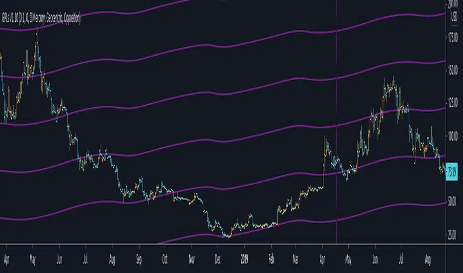
Gann Planetary Lines█ OVERVIEW
Gann Planetary Lines is one of the most powerful Gann Tools that converts planetary longitude angles into price. This script can be used in many different ways, methods, and trading systems.
This Script allows you to Plot Mercury, Venus, Mars, Jupiter, Saturn, Uranus, Neptune, and Pluto. While also allowing you to select the planetary line mode "Heliocentric" or "Geocentric"
One more important feature about this script. It also allows you to plot in the harmonics of these planetary lines : "Wheel of 24" ,"Semi-Sextile", "Semi-Square", "Sextile", "Quintile", "Square", "Trine", and "Opposition "
And of course you will be able to select the color of each one of the planets when it comes to styling.
One more important thing to mention, Yes you will be able to select the $/° value so you can square these lines perfectly in your chart!
█ Future Plans and upgrades to this script may include :
1. Further lines into the futures.
2. An option to Enable and Disable the 0° vertical line when the planet transition from 360° to 0°
3. Labels around the planetary lines to distinguish between them not only by color by text as well.
And more! Feel free to contact me with any feature that you would like to see in this script
█ How to use :
First of all, select the appropriate $/° value.
Then select the planet you would like to use from the list in the script's option.
Select the mode of the planet, "Heliocentric" or "Geocentric"
Make sure to enable the planet by clicking on the check mark.
Then you will be able to see these planets on your chart.
Additionally, I have included an option to add the harmonics to your planetary lines!
Simply select the harmonics that you would like to have and give it 10 seconds and it should be in your chart.
This script is coded as an addon to the Gann ToolBox package/scripts.
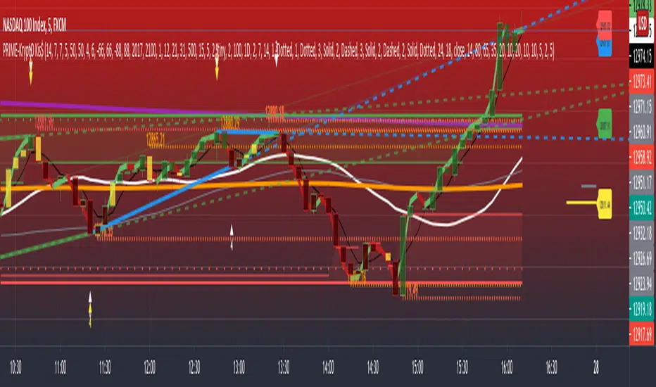
PRIME - Krypto Kiss+CCI+VPIntroducing from Prime Academy, the experimental "KryptO Kis$" algorithm, which combines our most powerful scripts all in one indicator. Available to the user are a full options platform to adjust parameters as well as individually blind indications for precise chart analysis. The following algorithms have been utilized:
* Prime Pulse (3 Candle System) - The original impulse and momentum indication system, it take rsi and tsi data to provide users with the indication of initial impulses, as well as a yellow candle to ascertain when there is a possible change of momentum in the current impulse.
* 5 SMA - The original Sniper Cross system seen from previous strategies, using the 4, 21, 50, 185, and 800 SMA's to determine changes of trend, continuation and support levels.
*CCI Indication on Chart - The system provides realtime CCI data in correlation to price positions within the general chart matrix, receiving system variables from various crosses on the 100 to -100 scale for CCI. Bullish and Bearish indications are clearly defined by separate colors.
* Volume Profile with tags - This system provides current volume data for the current time frame and sequence, also giving available tags at prices holding high volume orders, historically and present as indicated by the difference in length of indications. color saturations indicate the intensity of volume at the price in question .
* Shadow ZoneZ - Provides Support and resistance levels using rsi overbought and over sold data, sourced on the close of previous prices. Also embedded in the code is an additional volume confluence via indications of dotted lines with prices available, giving sequence positions of "Whales" and their support and resistance levels by order volume at price.
* An added bonus of the Shadow ZoneZ is the auto trend line and trend channel function , as well as the highlighted zones of liquidity waiting to be filled from previous impulses and lack of present retracements.
Any questions can be directed here on site via Direct Message. Any feedback is welcomed, and thank you in advance. Trade Well, Family!
- Dee Prime
//Disclaimer:
//Trading success is all about following your trading strategy and the indicators should fit within your trading strategy, and not to be traded upon solely
//The script is for informational and educational purposes only. Use of the script does not constitute professional and/or financial advice.
//You alone have the sole responsibility of evaluating the script output and risks associated with the use of the script.
//In exchange for using the script, you agree not to hold the publishing TradingView user liable for any possible claim for damages arising from any decision you make based on use of the script.
EMA TrendThe purpose of this script is to identify price trends based on EMAs. The relative position of price to specific EMAs and the position of certain EMAs towards each other are used to determine the trend direction. The script is intended for investors as a tool to define a basis for further evaluation. I do not use the script as a signal generator and would not recommend doing so without the help of additional indicators.
How to work with the script
The major (or long term) trend direction is determined by the 144 EMA much in the same way as the 200 MA is used in other systems. If the price is above the 144 EMA we are in a long term uptrend, below we are in a long term downtrend. This is to be taken with a grain of salt though. The 144 EMA is considerably shorter than the 200 SMA and is more prone to the price fluctuating around it during periods without a strong long term trend. I recommend using this as a confirmation for the short term trend.
The short term trend is derived from the position and slope of the price, the 21 EMA and the 55 EMA. If the price is above the 21 EMA, the 21 above the 55 EMA, both EMAs are sloping upwards and the distance between the two is increasing, we are talking about an uptrend (and vice versa for a downtrend). This is visualized by the color of the fill between the 144 EMA and close price. Green for uptrend, red for downtrend and no color for an undetermined trend.
The EMAs used are: 21 , 34 , 55 , 89 , 144 , 233 . Most of the EMAs are at 50 transparency to appear less dominant. For orientation, the 144 EMA is bright green to indicate its general importance for the trend determination, and the 55 EMAs is not transparent mainly to be able to identify positioning when the EMAs are close together.
Base time frame EMA
The 144 EMA is plotted twice where one is fixed to the daily time frame (can be configured) to be able to have the 144 on different timeframes during analysis. I find this very useful to keep the focus on my main time frame while analyzing trend on lower or higher time frames. This can also be turned off.
Configurability
This script is less configurable than I generally like with my other scripts. The reason is that the title attribute of the plots is not dynamic, and I use the data window often to get exact values from the script to determine buy targets for pullbacks and other things. Hence, I prefer not to have random names (or no names) in there to save mental capacity. If this ever becomes available, I'll gladly add this to this script. Till then, I encourage you to take the script and adjust it to your own needs. It should be simple enough even if you are just starting out in pine.
Waindrops [Makit0]█ OVERALL
Plot waindrops (custom volume profiles) on user defined periods, for each period you get high and low, it slices each period in half to get independent vwap, volume profile and the volume traded per price at each half.
It works on intraday charts only, up to 720m (12H). It can plot balanced or unbalanced waindrops, and volume profiles up to 24H sessions.
As example you can setup unbalanced periods to get independent volume profiles for the overnight and cash sessions on the futures market, or 24H periods to get the full session volume profile of EURUSD
The purpose of this indicator is twofold:
1 — from a Chartist point of view, to have an indicator which displays the volume in a more readable way
2 — from a Pine Coder point of view, to have an example of use for two very powerful tools on Pine Script:
• the recently updated drawing limit to 500 (from 50)
• the recently ability to use drawings arrays (lines and labels)
If you are new to Pine Script and you are learning how to code, I hope you read all the code and comments on this indicator, all is designed for you,
the variables and functions names, the sometimes too big explanations, the overall structure of the code, all is intended as an example on how to code
in Pine Script a specific indicator from a very good specification in form of white paper
If you wanna learn Pine Script form scratch just start HERE
In case you have any kind of problem with Pine Script please use some of the awesome resources at our disposal: USRMAN , REFMAN , AWESOMENESS , MAGIC
█ FEATURES
Waindrops are a different way of seeing the volume and price plotted in a chart, its a volume profile indicator where you can see the volume of each price level
plotted as a vertical histogram for each half of a custom period. By default the period is 60 so it plots an independent volume profile each 30m
You can think of each waindrop as an user defined candlestick or bar with four key values:
• high of the period
• low of the period
• left vwap (volume weighted average price of the first half period)
• right vwap (volume weighted average price of the second half period)
The waindrop can have 3 different colors (configurable by the user):
• GREEN: when the right vwap is higher than the left vwap (bullish sentiment )
• RED: when the right vwap is lower than the left vwap (bearish sentiment )
• BLUE: when the right vwap is equal than the left vwap ( neutral sentiment )
KEY FEATURES
• Help menu
• Custom periods
• Central bars
• Left/Right VWAPs
• Custom central bars and vwaps: color and pixels
• Highly configurable volume histogram: execution window, ticks, pixels, color, update frequency and fine tuning the neutral meaning
• Volume labels with custom size and color
• Tracking price dot to be able to see the current price when you hide your default candlesticks or bars
█ SETTINGS
Click here or set any impar period to see the HELP INFO : show the HELP INFO, if it is activated the indicator will not plot
PERIOD SIZE (max 2880 min) : waindrop size in minutes, default 60, max 2880 to allow the first half of a 48H period as a full session volume profile
BARS : show the central and vwap bars, default true
Central bars : show the central bars, default true
VWAP bars : show the left and right vwap bars, default true
Bars pixels : width of the bars in pixels, default 2
Bars color mode : bars color behavior
• BARS : gets the color from the 'Bars color' option on the settings panel
• HISTOGRAM : gets the color from the Bearish/Bullish/Neutral Histogram color options from the settings panel
Bars color : color for the central and vwap bars, default white
HISTOGRAM show the volume histogram, default true
Execution window (x24H) : last 24H periods where the volume funcionality will be plotted, default 5
Ticks per bar (max 50) : width in ticks of each histogram bar, default 2
Updates per period : number of times the histogram will update
• ONE : update at the last bar of the period
• TWO : update at the last bar of each half period
• FOUR : slice the period in 4 quarters and updates at the last bar of each of them
• EACH BAR : updates at the close of each bar
Pixels per bar : width in pixels of each histogram bar, default 4
Neutral Treshold (ticks) : delta in ticks between left and right vwaps to identify a waindrop as neutral, default 0
Bearish Histogram color : histogram color when right vwap is lower than left vwap, default red
Bullish Histogram color : histogram color when right vwap is higher than left vwap, default green
Neutral Histogram color : histogram color when the delta between right and left vwaps is equal or lower than the Neutral treshold, default blue
VOLUME LABELS : show volume labels
Volume labels color : color for the volume labels, default white
Volume Labels size : text size for the volume labels, choose between AUTO, TINY, SMALL, NORMAL or LARGE, default TINY
TRACK PRICE : show a yellow ball tracking the last price, default true
█ LIMITS
This indicator only works on intraday charts (minutes only) up to 12H (720m), the lower chart timeframe you can use is 1m
This indicator needs price, time and volume to work, it will not work on an index (there is no volume), the execution will not be allowed
The histogram (volume profile) can be plotted on 24H sessions as limit but you can plot several 24H sessions
█ ERRORS AND PERFORMANCE
Depending on the choosed settings, the script performance will be highly affected and it will experience errors
Two of the more common errors it can throw are:
• Calculation takes too long to execute
• Loop takes too long
The indicator performance is highly related to the underlying volatility (tick wise), the script takes each candlestick or bar and for each tick in it stores the price and volume, if the ticker in your chart has thousands and thousands of ticks per bar the indicator will throw an error for sure, it can not calculate in time such amount of ticks.
What all of that means? Simply put, this will throw error on the BITCOIN pair BTCUSD (high volatility with tick size 0.01) because it has too many ticks per bar, but lucky you it will work just fine on the futures contract BTC1! (tick size 5) because it has a lot less ticks per bar
There are some options you can fine tune to boost the script performance, the more demanding option in terms of resources consumption is Updates per period , by default is maxed out so lowering this setting will improve the performance in a high way.
If you wanna know more about how to improve the script performance, read the HELP INFO accessible from the settings panel
█ HOW-TO SETUP
The basic parameters to adjust are Period size , Ticks per bar and Pixels per bar
• Period size is the main setting, defines the waindrop size, to get a better looking histogram set bigger period and smaller chart timeframe
• Ticks per bar is the tricky one, adjust it differently for each underlying (ticker) volatility wise, for some you will need a low value, for others a high one.
To get a more accurate histogram set it as lower as you can (min value is 1)
• Pixels per bar allows you to adjust the width of each histogram bar, with it you can adjust the blank space between them or allow overlaping
You must play with these three parameters until you obtain the desired histogram: smoother, sharper, etc...
These are some of the different kind of charts you can setup thru the settings:
• Balanced Waindrops (default): charts with waindrops where the two halfs are of same size.
This is the default chart, just select a period (30m, 60m, 120m, 240m, pick your poison), adjust the histogram ticks and pixels and watch
• Unbalanced Waindrops: chart with waindrops where the two halfs are of different sizes.
Do you trade futures and want to plot a waindrop with the first half for the overnight session and the second half for the cash session? you got it;
just adjust the period to 1860 for any CME ticker (like ES1! for example) adjust the histogram ticks and pixels and watch
• Full Session Volume Profile: chart with waindrops where only the first half plots.
Do you use Volume profile to analize the market? Lucky you, now you can trick this one to plot it, just try a period of 780 on SPY, 2760 on ES1!, or 2880 on EURUSD
remember to adjust the histogram ticks and pixels for each underlying
• Only Bars: charts with only central and vwap bars plotted, simply deactivate the histogram and volume labels
• Only Histogram: charts with only the histogram plotted (volume profile charts), simply deactivate the bars and volume labels
• Only Volume: charts with only the raw volume numbers plotted, simply deactivate the bars and histogram
If you wanna know more about custom full session periods for different asset classes, read the HELP INFO accessible from the settings panel
EXAMPLES
Full Session Volume Profile on MES 5m chart:
Full Session Unbalanced Waindrop on MNQ 2m chart (left side Overnight session, right side Cash Session):
The following examples will have the exact same charts but on four different tickers representing a futures contract, a forex pair, an etf and a stock.
We are doing this to be able to see the different parameters we need for plotting the same kind of chart on different assets
The chart composition is as follows:
• Left side: Volume Labels chart (period 10)
• Upper Right side: Waindrops (period 60)
• Lower Right side: Full Session Volume Profile
The first example will specify the main parameters, the rest of the charts will have only the differences
MES :
• Left: Period size: 10, Bars: uncheck, Histogram: uncheck, Execution window: 1, Ticks per bar: 2, Updates per period: EACH BAR,
Pixels per bar: 4, Volume labels: check, Track price: check
• Upper Right: Period size: 60, Bars: check, Bars color mode: HISTOGRAM, Histogram: check, Execution window: 2, Ticks per bar: 2,
Updates per period: EACH BAR, Pixels per bar: 4, Volume labels: uncheck, Track price: check
• Lower Right: Period size: 2760, Bars: uncheck, Histogram: check, Execution window: 1, Ticks per bar: 1, Updates per period: EACH BAR,
Pixels per bar: 2, Volume labels: uncheck, Track price: check
EURUSD :
• Upper Right: Ticks per bar: 10
• Lower Right: Period size: 2880, Ticks per bar: 1, Pixels per bar: 1
SPY :
• Left: Ticks per bar: 3
• Upper Right: Ticks per bar: 5, Pixels per bar: 3
• Lower Right: Period size: 780, Ticks per bar: 2, Pixels per bar: 2
AAPL :
• Left: Ticks per bar: 2
• Upper Right: Ticks per bar: 6, Pixels per bar: 3
• Lower Right: Period size: 780, Ticks per bar: 1, Pixels per bar: 2
█ THANKS TO
PineCoders for all they do, all the tools and help they provide and their involvement in making a better community
scarf for the idea of coding a waindrops like indicator, I did not know something like that existed at all
All the Pine Coders, Pine Pros and Pine Wizards, people who share their work and knowledge for the sake of it and helping others, I'm very grateful indeed
I'm learning at each step of the way from you all, thanks for this awesome community;
Opensource and shared knowledge: this is the way! (said with canned voice from inside my helmet :D)
█ NOTE
This description was formatted following THIS guidelines
═════════════════════════════════════════════════════════════════════════
I sincerely hope you enjoy reading and using this work as much as I enjoyed developing it :D
GOOD LUCK AND HAPPY TRADING!

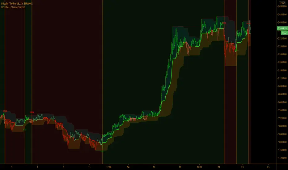
TradeChartist Donchian Channels Breakout Filter™TradeChartist Donchian Channels Breakout Filter is an elegant version of the classic Donchian Channels with few extra variations and option to filter breakouts based on user preferred Breakout price selection to generate Trade Entries.
===================================================================================================================
Features of ™TradeChartist Donchian Channels Breakout Filter
======================================================
Option to plot Donchian Channels of user preferred length, based on the Source price in addition to High/Low Donchian Channels.
Generates trade entries based on user preferred Breakout Price. For example, if the user prefers HL2 as breakout price, irrespective of the Donchian Channels type, trade entries are generated only when hl2 price (average of high/low) breaks out of the upper or lower band.
Option to plot background colour based on Breakout trend. The bull zones are filled with green background, the Bear zones are filled with red background and the bar that broke out is filled with orange background.
Option to colour price bars using Donchian Channels price trend. The Donchian Channels basis line is plotted using the same colours as coloured bars as default.
Alerts can be created for long and short entries using Once per Bar Close .
Note: This script does not repaint . To use the script for trade entries, wait for the bar close and use a second confirmator (includes fundamentals) based on asset type as some markets require users to have good pulse on the fundamentals as trading by Technicals/price action dynamic alone may not be safe.
===================================================================================================================
Best Practice: Test with different settings first using Paper Trades before trading with real money
===================================================================================================================
This is not a free to use indicator. Get in touch with me (PM me directly if you would like trial access to test the indicator)
Premium Scripts - Trial access and Information
Trial access offered on all Premium scripts.
PM me directly to request trial access to the scripts or for more information.
===================================================================================================================
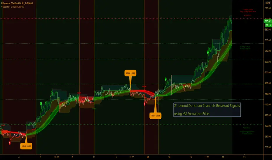
TradeChartist Visualizer ™TradeChartist Visualizer is a fully packed Trader's toolkit that helps decide Trade Entries and Exits based on Bollinger Bands and Donchian Channels breakouts and can be further exploited by the use of various visualizers and built in Filters like Ichimoku Cloud, 15 different Moving Averages, RSI, TradeChartist's original MA Visualizer and Automatic Levels Generator.
===================================================================================================================
Bollinger Bands is a classic indicator that uses a simple moving average of 20 periods, along with plots of upper and lower bands that are 2 standard deviations away from the basis line. These bands help visualize price volatility and trend based on where the price is, in relation to the bands.
Donchian Channels comprises of three plots - a upper band, a lower band and a mean line (or mid line of the channel). The upper band is based on highest high of N periods specified by the user and the lower band is based on the lowest low of N periods specified by the user. These channels help spot price breaching high or low of last N periods clearly, thereby aiding the trader to understand the price action of any security better on any given timeframe.
===================================================================================================================
╔═════ 𝗕𝗕 & 𝗗𝗼𝗻𝗰𝗵𝗶𝗮𝗻 𝗖𝗵𝗮𝗻𝗻𝗲𝗹𝘀 ═════╗
™TradeChartist Visualizer is based on the idea of Bollinger Bands and Donchian Channels Breakout model for generating Trade Entries. Visualizer uses the following three fundamental plot options from the settings that the user can choose from, to spot breakouts, support/resistance levels and the trading price range of the security.
1. Bollinger Bands
The 𝟏. 𝐁𝐨𝐥𝐥𝐢𝐧𝐠𝐞𝐫 𝐁𝐚𝐧𝐝𝐬 option plots the Bollinger Bands for the chart timeframe (default is 55 SMA with 1 standard Deviation). This can be changed by entering different values in BB Sᴛᴀɴᴅᴀʀᴅ Dᴇᴠɪᴀᴛɪᴏɴ and MA Lᴇɴɢᴛʜ ғᴏʀ BB/Dᴏɴᴄʜɪᴀɴ Cʜᴀɴɴᴇʟs .
To use a different Moving Average for the Bollinger Bands Basis line, uncheck 𝐒𝐌𝐀 𝐁𝐁 𝐨𝐧𝐥𝐲 - 𝐔𝐧𝐜𝐡𝐞𝐜𝐤 𝐟𝐨𝐫 𝐧𝐨𝐧-𝐒𝐌𝐀 𝐁𝐁
The option is enabled as default as it keeps the SMA as standard. Unchecking this option and choosing a different moving average out of the 15 MAs in the dropdown, the plot changes significantly for each. Also a warning label will appear on screen if Standard Deviation more than 1 is used for non standard MA for Bollinger Bands, as the settings must be tested for non-standard Bollinger Bands before planning to trade with it.
2. True Donchian Channels
The 𝟐. 𝐓𝐫𝐮𝐞 𝐃𝐨𝐧𝐜𝐡𝐢𝐚𝐧 𝐂𝐡𝐚𝐧𝐧𝐞𝐥𝐬 option plots Donchian Channels by inspecting the lookback lengths for highest highs and lowest lows of the user specified periods, which can be changed in Uᴘᴘᴇʀ Dᴏɴᴄʜɪᴀɴ Cʜᴀɴɴᴇʟ Lᴇɴɢᴛʜ and Lᴏᴡᴇʀ Dᴏɴᴄʜɪᴀɴ Cʜᴀɴɴᴇʟ Lᴇɴɢᴛʜ user input boxes from Visualizer settings.
3. Donchian Channels - MA and Non-MA Source
The 𝟑. 𝐃𝐨𝐧𝐜𝐡𝐢𝐚𝐧 𝐂𝐡𝐚𝐧𝐧𝐞𝐥𝐬 - 𝐌𝐀/𝐍𝐨𝐧-𝐌𝐀 𝐒𝐨𝐮𝐫𝐜𝐞 option plots modified Donchian Channels based on highest high and lowest low of Moving Average or the Source using user specified periods, which can be changed in Uᴘᴘᴇʀ Dᴏɴᴄʜɪᴀɴ Cʜᴀɴɴᴇʟ Lᴇɴɢᴛʜ , Lᴏᴡᴇʀ Dᴏɴᴄʜɪᴀɴ Cʜᴀɴɴᴇʟ Lᴇɴɢᴛʜ , MA Lᴇɴɢᴛʜ ғᴏʀ BB/Dᴏɴᴄʜɪᴀɴ Cʜᴀɴɴᴇʟs choosing the source plot from Sᴏᴜʀᴄᴇ and MA Type from MA ᴛʏᴘᴇ - (ғᴏʀ ᴘʟᴏᴛs 1 & 3) . For Donchian Channels plot of Non-MA Source, choose Use Source from MA ᴛʏᴘᴇ - (ғᴏʀ ᴘʟᴏᴛs 1 & 3) dropdown.
===================================================================================================================
╔═════════ 𝗠𝗔 𝗩𝗶𝘀𝘂𝗮𝗹𝗶𝘇𝗲𝗿 ═════════╗
MA Visualizer is a powerful and very useful original visual method to plot Moving Averages of the close price of the security for user specified look back period in a visually appealing style in the form of colour coded bands. MA Visualizer not only helps the trader spot the price action of the security relative to the moving average, but also paints a visual picture of the trend strength, which must be seen and used on chart to appreciate its elegance.
Activate 𝗠𝗔 𝗩𝗶𝘀𝘂𝗮𝗹𝗶𝘇𝗲𝗿 and choose the MA type from MA Vɪsᴜᴀʟɪᴢᴇʀ Tʏᴘᴇ dropdown and entering the lookback period in MA Vɪsᴜᴀʟɪᴢᴇʀ ᴘᴇʀɪᴏᴅ input box. MA Visualizer colour theme can be be changed from MA Vɪsᴜᴀʟɪᴢᴇʀ Cᴏʟᴏʀ Sᴄʜᴇᴍᴇ dropdown.
The faster of the two set of bands that form the MA Visualizer reacts to price action faster and can be clearly seen from its change of colour from Bull Colour to Bear Colour or viceversa earlier than the slower set of bands. The fill colour between the bands also helps the user stay in a trade or exit a trade based on other confirmators or filters included in ™TradeChartist Visualizer .
===================================================================================================================
╔═══════ 𝗦𝗶𝗴𝗻𝗮𝗹𝘀 𝗮𝗻𝗱 𝗙𝗶𝗹𝘁𝗲𝗿𝘀 ═══════╗
𝗦𝗶𝗴𝗻𝗮𝗹𝘀
Trade Signals can be enabled along with use of various filters from this heading in Visualizer settings. To plot Trade entry markers on chart when a trade signal is generated, enable 𝐁𝐁/𝐃𝐨𝐧𝐜𝐡𝐢𝐚𝐧 𝐂𝐡𝐚𝐧𝐧𝐞𝐥𝐬 𝐁𝐫𝐞𝐚𝐤𝐨𝐮𝐭 𝐒𝐢𝐠𝐧𝐚𝐥𝐬.
The script automatically detects the breakouts based on user specified settings under 𝗕𝗕 & 𝗗𝗼𝗻𝗰𝗵𝗶𝗮𝗻 𝗖𝗵𝗮𝗻𝗻𝗲𝗹𝘀. Trade Entries are plotted on the real-time breakout candle, so it is recommended to wait for bar close before taking a position in the direction of the breakout.
𝗙𝗶𝗹𝘁𝗲𝗿𝘀
Various Filters can be used from this heading to reduce noise and help make the trade decision more effective and eliminates unproductive trades when the price is ranging or during sideways movement.
To use Filters, enable 𝐔𝐬𝐞 𝐓𝐫𝐚𝐝𝐞 𝐅𝐢𝐥𝐭𝐞𝐫 and choose the Filters from under Tʀᴀᴅᴇ Fɪʟᴛᴇʀ 1 and Tʀᴀᴅᴇ Fɪʟᴛᴇʀ 2 . If --- is chosen, no filter will be used. Trade filter parameters can be changed from under 𝗙𝗶𝗹𝘁𝗲𝗿 𝗣𝗮𝗿𝗮𝗺𝗲𝘁𝗲𝗿𝘀 section of Visualizer settings. The two trade filter dropdowns enable traders to use upto 2 filters from the following.
══> MA filter - This filters entries after a breakout only if the close price had breached the MA price. Filter MA is based on the same settings as MA Visualizer. This MA used for Filter can also be plotted by enabling 𝐃𝐢𝐬𝐩𝐥𝐚𝐲 𝐌𝐀 𝐅𝐢𝐥𝐭𝐞𝐫 (𝐌𝐀 𝐕𝐢𝐬𝐮𝐚𝐥𝐢𝐳𝐞𝐫 𝐒𝐞𝐭𝐭𝐢𝐧𝐠𝐬). To view this MA plot clearly, disable MA Visualizer.
══> MA Visualizer filter - This filters entries after a breakout only if both set of MA Visualizer bands had turned into same colour (either Bull or Bear Colour) agreeing with the direction of the breakout.
══> RSI filter - This filters entries after a breakout only if the RSI had crossed above RSI - Lᴏɴɢ Eɴᴛʀʏ Fɪʟᴛᴇʀ for Longs or if RSI had crossed below RSI - Sʜᴏʀᴛ Eɴᴛʀʏ Fɪʟᴛᴇʀ .
══> Kumo Breakout filter - This filters entries after a breakout only if price had closed above or below the Kumo of the Ichimoku Cloud in the direction of the breakout.
══> Price crossing Kijun Sen - This filters entries after a breakout only if close price had crossed Kijun Sen or the Ichimoku Base Line in the direction of the breakout.
To visualize the Kumo Breakout or Price crossing Kijun Sen, Ichimoku Cloud can be plotted on chart by enabling 𝐃𝐢𝐬𝐩𝐥𝐚𝐲 𝐈𝐜𝐡𝐢𝐦𝐨𝐤𝐮 𝐂𝐥𝐨𝐮𝐝 from 𝗙𝗶𝗹𝘁𝗲𝗿 𝗣𝗮𝗿𝗮𝗺𝗲𝘁𝗲𝗿𝘀 section of Visualizer settings.
===================================================================================================================
╔═══ 𝗔𝘂𝘁𝗼𝗺𝗮𝘁𝗶𝗰 𝗟𝗲𝘃𝗲𝗹𝘀 𝗚𝗲𝗻𝗲𝗿𝗮𝘁𝗼𝗿 ════╗
Enabling 𝗔𝘂𝘁𝗼𝗺𝗮𝘁𝗶𝗰 𝗟𝗲𝘃𝗲𝗹𝘀 𝗚𝗲𝗻𝗲𝗿𝗮𝘁𝗼𝗿 plots support and resistance levels automatically without any input from the user other than preferred levels plot from the indicator settings namely,
Plot Local Levels for Lower TF - Plots all important Support/Resistance levels for mostly smaller time frames (can be used for up to 1hr in most cases). Recommended for Scalping/Swing Trading mostly dependent on volatility.
Plot Local Levels for Higher TF - Plots all important Support/Resistance levels inferred from mostly time frames - Short to Mid term outlook.
Use Trading View Data Window to make effective use of the levels.
===================================================================================================================
╔═════════ 𝗨𝘀𝗲𝗳𝘂𝗹 𝗘𝘅𝘁𝗿𝗮𝘀 ═════════╗
Volatility exhaustion is detected by the script and plots $ on bar highs for Long Trades and bar lows for Short Trades if Tᴀᴋᴇ Pʀᴏғɪᴛ Bᴀʀs is enabled.
Candles/Bars can be colored with Price action trend strength by enabling Vɪsᴜᴀʟɪᴢᴇʀ Cᴏʟᴏʀ Bᴀʀs and by choosing one of two themes from Bᴀʀ Cᴏʟᴏʀ Sᴄʜᴇᴍᴇ . Bar colors can also be inverted using Iɴᴠᴇʀᴛ Bᴀʀ Cᴏʟᴏʀs option.
To paint the background of the chart to spot trade zones, enable Tʀᴀᴅᴇ Zᴏɴᴇs Bᴀᴄᴋɢʀᴏᴜɴᴅ Fɪʟʟ .
Alerts
Alerts can be created for Long and Short entries by using Once Per Bar Close as Alert Frequency. Entries are generated on Real time bars based on Breakout and filter conditions. It is recommended to wait for bar close before taking a position based on Visualizer Trade Entries.
The indicator does not repaint and can be confidently used for alerts and trade entries without worrying about signals disappearing.
™TradeChartist Visualizer can also be connected to ™TradeChartist Plug and Trade to generate entries along with Targets, Stop Loss plots etc. Target and Stop Loss alerts can be created using Plug and Trade's Alerts system.
===================================================================================================================
There are several combinations of settings that can be tested on the security traded based on timeframe and risk/reward expectations. The indicator can be used for trade entries with filter combinations or can be used as standalone Visualizer for trend confirmations, levels etc. Following are a few examples using the Visualizer.
Example Charts
1. ETH-USDT 1hr chart using Bollinger Bands (55/1, SMA) with 89 period Hull MA as MA Visualizer filter for BB Entries.
2. AAPL 1hr chart using 34 period Donchian Channels with 89 period Zero-Lag EMA as MA Visualizer filter for Entries.
3.EUR-USD 1hr chart using 34 period Donchian Channels with 89 period TEMA as MA Visualizer Filter for Entries.
4. XBT Daily chart using 9/21 Donchian Channels with Kumo Breakout Filter and 34 period Hull MA Visualizer Filter for Entries connected to Plug and Trade.
5. LINK-USDT 1hr chart using 34 period Donchian Channels with 55 period LSMA MA Visualizer Filter for Entries with Ichimoku Cloud Plot.
===================================================================================================================
Best Practice: Test with different settings first using Paper Trades before trading with real money
===================================================================================================================
This is not a free to use indicator. Get in touch with me (PM me directly if you would like trial access to test the indicator)
Premium Scripts - Trial access and Information
Trial access offered on all Premium scripts.
PM me directly to request trial access to the scripts or for more information.
===================================================================================================================
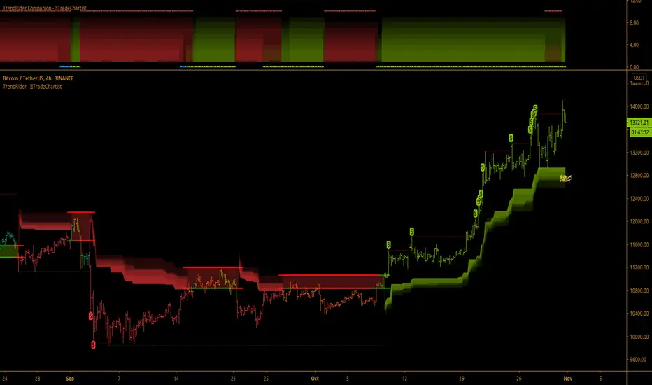
TradeChartist TrendRider ™TradeChartist TrendRider is an exceptionally beautiful and a functional indicator that does exactly what it says on the tin. The indicator rides the trend based on Momentum, Volatility, detecting critical zones of Support and Resistance along the way, which helps the indicator find the right trend to ride, plotting Trend Markers and Trade Signals based on only one piece of User input - TrendRider Type (Aggressive, Normal or Laid Back).
===================================================================================================================
What does ™TradeChartist TrendRider do?
™TradeChartist TrendRider dynamically calculates Support and Resistance levels when riding a trend and uses these levels for confirmation on breach or fail (on a candle close), before reversing from the current trend it is riding. The change of trend is signalled using Bᴜʟʟs or Bᴇᴀʀs labels which are plotted upon confirmation of the Trend.
TrendRider plots Bull and Bear Trend Markers on chart, which helps the user get a visual confirmation of the Trend.
TrendRider also plots $ signs to show Take Profit Bars and also paints Trend strength on price bars based on the Color Scheme, if these options are enabled from the indicator settings.
The above features can be clearly seen on the 1 hr chart of GBP-USD below.
===================================================================================================================
How to create Alerts for ™TradeChartist TrendRider Long and Short Entries?
Alerts can be created for Long or Short entries using Once Per Bar as Bᴜʟʟs or Bᴇᴀʀs labels appear only on confirmation after bar close.
===================================================================================================================
Does the indicator include Stop Loss and Take Profit plots?
This script doesn't have Stop Loss and Take Profit plots, but it can be connected to ™TradeChartist Plug and Trade as Oscillatory signal (" TrendRider Signal ") to generate Automatic Targets, set StopLoss and Take Profit plots and to create all types of alerts too. The 4hr chart of ICX-BTC below shows TrendRider connected to ™TradeChartist Plug and Trade.
===================================================================================================================
Does this indicator repaint?
No. This script doesn't repaint as it confirms its signals only after close above/below TrendRider's dynamic level and also uses security function to call higher time-frame values in the right way to avoid repainting. This can be verified using Bar Replay to check if the plots and fills stay in the same bar in real time as the Bar Replay.
===================================================================================================================
Example charts using TrendRider
Daily chart of BTC-USD
===================================================================================================================
15m chart of SPX
===================================================================================================================
1hr chart of ADA-USDT
===================================================================================================================
15m chart of XAU-USD
===================================================================================================================
4hr chart of Dow Jones Industrial Average
===================================================================================================================
Best Practice: Test with different settings first using Paper Trades before trading with real money
===================================================================================================================
This is not a free to use indicator. Get in touch with me (PM me directly if you would like trial access to test the indicator)
Premium Scripts - Trial access and Information
Trial access offered on all Premium scripts.
PM me directly to request trial access to the scripts or for more information.
===================================================================================================================
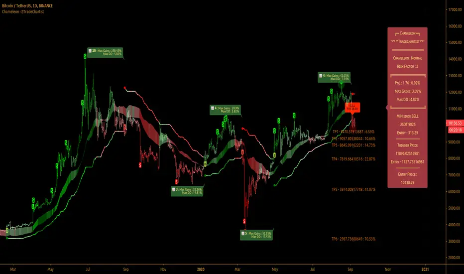
TradeChartist Chameleon™TradeChartist Chameleon is an exceptionally beautiful trend following indicator (visualised using Chameleon plot) based on Momentum and Volatility using User input of Chameleon Mode and Risk factor (ATR multiple) to generate Trade Opportunities.
===================================================================================================================
™TradeChartist Chameleon Features
Minimal user input of Chameleon Mode Selection from (Aggressive, Normal and Laid Back) and Chameleon Risk Factor (Min - 1, Max - 5 of ATR Multiple).
---> For Higher Timeframes, lower Risk Factor is recommended (Max - 3) as the trading range can be high based on Volatility.
---> For Lower Timeframes, higher Risk Factor can be used (Normal or Laid Back Mode) based on asset price volatility.
Comprehensive Chameleon Dashboard with useful information like Real-time Gains Tracker , User settings and general trade information. Dashboard can be customised based on user preference from Chameleon Settings.
Automatic Targets based on Trade.
Option to paint Price Bars to help identify Price Trend.
Option to display Profit Taking Bars (enabling this from settings will paint $ signs where Profit taking is recommended).
Option to color background based on trade type.
Alerts can be created for Long and Short Entry Signals using "Once per Bar" as Trade Entries are generated only upon confirmation (previous candle close below/above Chameleon Trigger line).
===================================================================================================================
How to create Alerts for ™TradeChartist Chameleon Long and Short Entries?
Alerts can be created for Long or Short entries using Once Per Bar as BUY and SELL labels appear with entries only on confirmation after bar close.
Does the indicator include Stop Loss and Take Profit plots?
This script doesn't have Stop Loss and Take Profit plots, but it can be connected to ™TradeChartist Plug and Trade as Oscillatory signal (" Chameleon ") to set StopLoss and Take Profit plots and to create all types of alerts too.
Does this indicator repaint?
No. This script doesn't repaint as it confirms its signals only after close above/below Chameleon Trigger line and also uses security function to call higher time-frame values in the right way to avoid repainting. This can be verified using Bar Replay to check if the plots and fills stay in the same bar in real time as the Bar Replay.
===================================================================================================================
Best Practice: Test with different settings first using Paper Trades before trading with real money
===================================================================================================================
This is not a free to use indicator. Get in touch with me (PM me directly if you would like trial access to test the indicator)
Premium Scripts - Trial access and Information
Trial access offered on all Premium scripts.
PM me directly to request trial access to the scripts or for more information.
===================================================================================================================
TradeChartist MTF Supertrend Pro™TradeChartist MTF SuperTrend Pro is the Multi Time-Frame version (using timeframe multiplier) of classic Volatility Stop or SuperTrend (Stop and Reverse indicator using multiple of Average True Range of lookback period trailing behind the price acting as both trend reversal signifier and StopLoss trigger at the same time ).
What does ™TradeChartist MTF SuperTrend Pro include?
Multi Time-Frame option using Time-Frame Multiplier to plot Higher Time Frame SuperTrend plot on Lower Time-Frame chart.
Auto-fibs - 2 types (1. Retracement from last significant high/low to previous significant low/high, 2. Retracement from Current High/Low to previous significant Low/High).
Trend identifying color bars.
Trend identifying Background colour.
Option to detect bars where Profit Taking is recommended using $ sign.
How to create Alerts for ™TradeChartist MTF SuperTrend Pro Long and Short Entries?
Alerts can be created for Long or Short entries using Once Per Bar as BUY and SELL labels appear with entries only on confirmation after bar close.
Does the indicator include Stop Loss and Take Profit plots?
This script doesn't have Stop Loss and Take Profit plots, but it can be connected to TradeChartist Plug and Trade as Non-Oscillatory signal to generate Automatic Targets, user set StopLoss and Take Profit plots and to create all types of alerts too.
Does this indicator repaint?
No. This script doesn't repaint as it confirms its signals only after close above/below SuperTrend plot and also uses security function to call higher time-frame values in the right way to avoid repainting. This can be verified using Bar Replay to check if the plots and fills stay in the same bar in real time as the Bar Replay.
===================================================================================================================
Tip 1: Using 1.618 as Timeframe Multiplier results in lucrative trades on most timeframes with ATR multiplier 1.618, 2.618 or 3.618. (Best Practice: Test with various values first on asset using Paper Trades before trading with real money)
Tip 2: Using bars, candles with no borders or Hollow Candles results in clear trend spotting with Bar color option enabled in settings.
===================================================================================================================
Chart below shows Performance of MTF SuperTrend Pro connected to Plug and Trade using Default settings.
===================================================================================================================
This is not a free to use indicator. Get in touch with me (PM me directly if you would like trial access to test the indicator)
Premium Scripts - Trial access and Information
Trial access offered on all Premium scripts.
PM me directly to request trial access to the scripts or for more information.
===================================================================================================================
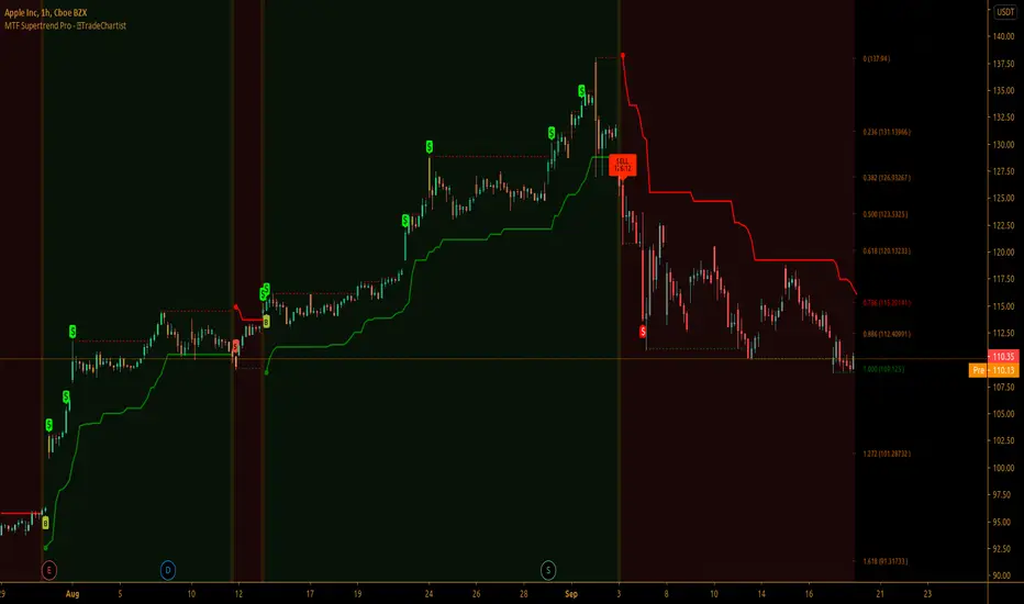
TradeChartist PowerTracer™TradeChartist PowerTracer is an exceptionally well designed and functional indicator, requiring minimal user input to trace the asset's Bull and Bear Power. The indicator makes it visually engaging with its various color schemes and intelligent positioning of the PowerTracer Bar, tracking not just the current trend, but also the developing trend using a visually easy to understand Power plots.
What does ™TradeChartist PowerTracer do?
1. Tracks Bull and Bear Power and plots the information visually on chart using one of the following 3 Power plot options based on high or low power detection sensitivity.
𝗣𝗼𝘄𝗲𝗿𝗧𝗿𝗮𝗰𝗲𝗿 - Plot of the Bull and Bear Power Oscillator, pivotal to this script that tracks the true Bull and Bear Power along with Bull/Bear oscillator reading, calculated dynamically using a unique and original formula. Values beyond 50 and -50 are quite rare, but theoretically, they can go beyond 80 and -80. 𝗣𝗼𝘄𝗲𝗿𝗧𝗿𝗮𝗰𝗲𝗿's highs and lows are also tracked and updated real-time using labels placed exactly at the Highs and Lows with their readings.
Bar-wise Power Holder - Absolute Bull and Bear power of each bar. It is plotted by calculating the difference between Bull and Bear Power or each bar. The values can swing between -100 and +100 even though values above 90 and below 90 are rare. The bar color on the chart will be painted using this value to visually display the Bull/Bear strength if "Paint Bars on Chart" is enabled from the indicator settings.
Bar-wise Power Fight - Plot of Maximum Bull and Bear Power of every bar that helps visualize the fight between Bulls and Bears in each bar.
2. Visually displays the Balance of Power between the Bulls and the Bears using Opponent Power Gain background fill when it is 50% or over. For example, if the current PowerTracer plot is a Bull zone, enabling this setting with Opponent Power Gain % set at 75, will paint the background when Bear Power increases beyond 75% using the Bear Power Intensity fill based on Color Scheme the user opts from the settings. This option can be enabled or disabled from settings and the Opponent Power gain % (minimum 50%) can also be adjusted to spot the change in price trend early on.
3. Uses an accompanying 𝗣𝗼𝘄𝗲𝗿𝗧𝗿𝗮𝗰𝗲𝗿 bar that helps spot the true bull and bear power using simple linear blocks, displaying the power level using power intensity colors based on the color scheme.
4. Paints price bars and PowerTracer background using Power intensity colors based on Color Scheme from the indicator settings, which helps spot the increase or decrease in Bull and Bear Power.
5. Inverts bar colors, background fill and PowerTracer bar color to help see price using the Opponent's Point of View.
What markets can this indicator be used on?
-- Forex
-- Stocks - works best with 4hr or above and prices calculated taking gaps into account.
-- Commodities
-- Cryptocurrencies
and almost any asset on Trading View
What time-frames can this indicator be used on?
This indicator can be used on all timeframes. If the asset has very little volume/volatility or is far low in comparative value against the base currency, power detection can be choppy, but with most assets, this won't be an issue.
Does this indicator repaint?
-- No. Real-time Power plots can change colors and values based on current bar close as values get calculated dynamically. Once the bar closes, plots and power intensity colors don't repaint.
-- This can be verified using Bar Replay to check if the plots and fills stay in the same bar in real time as the Bar Replay
Does the indicator send alerts when the power shifts from Bull to Bear or from Bear to Bull?
Yes. Users can get alerts when Power gets shifted using Trading View alerts. This can be done by choosing '™TradeChartist PowerTracer' and 'Powershift to Bulls' or 'Powershift to Bears' under Trading View Alert condition and by using 'Once per bar close' as user needs to wait for candle close for Power shift confirmation.
Example Charts
In this split screen chart of Bitcoin, it can be seen how the 30m chart on left is Bearish and 5m chart on right is Bullish based on Power changes. The trend can be spotted on PowerTracer by spotting the Opponent's background fill that started showing when Opponent's power gained by over 75%. This is a good example using the script for scalping/swing trading using 2 timeframes. Note that the chart on the left shows Price bars and PowerTracer bar with inverted colors to show Opponent's point of view.
In this 15m chart of GBP-USD, 100% Power gain for Entries and Exits is used. This is a more conservative approach and is suited for less aggressive traders based on complete change of trend.
In this 2hr chart of Ethereum, all 3 Power plots are used to identify the trend using low sensitivity using 100% Power Gain entries and this shows how a trade can be held longer to maximise gains using entries with Power shift confirmations.
===================================================================================================================
This is not a free to use indicator. Get in touch with me (PM me directly if you would like trial access to test the indicator)
Premium Scripts - Trial access and Information
Trial access offered on all Premium scripts.
PM me directly to request trial access to the scripts or for more information.
===================================================================================================================

TFi Double Stochastic StudyThe Study script uses Stochastic indicators for entry and exit a position.
The entry and exit points are visualized in the chart via green arrows and crosses; the position follows the exact behavior of the strategy script.
The study also creates alerts, which follow the exact position of the entry/exit markers.
How to use
The Study works with most timeframes and instruments.
I'm also providing a "strategy" version of this Study, which can be used to backtest the strategy.
List of parameters
"Stochastic Length" ... Number of bars for Stochastic indicators
"Stochastic Overbought" ... Stochastic overbought level
"Stochastic Overbought Down Trend" ... Stochastic overbought level for down trends
"Stochastic Oversold Up Trend" ... Stochastic oversold level for up trends
"Stochastic Oversold" ... Stochastic oversold level
"Stochastic Smooth K" ... Stochastic K smoothing
"Stochastic Smooth D" ... Stochastic D smoothing
"Stochastic Confirmed" ... Enable to confirm the indicator value within the current bar
"MA Filter Enabled" ... Enable an additional filter for entering a position; the entries only follow the overall trend
"MA Fast Period" ... Fast filter period
"MA Slow Period" ... Slow filter period
List of alerts
Entry Long' ... Enter long position
'Entry Short' ... Enter short position
'Exit Long/Short' ... Exit long/short position
How to access
This Study is a "Invite Only" script. Please use the link below or send me a message via Tradingview to obtain access to the strategy and study script.
For enabling the script in your Tradingview chart window, click on "Indicators" and select "Invite-Only Scripts".
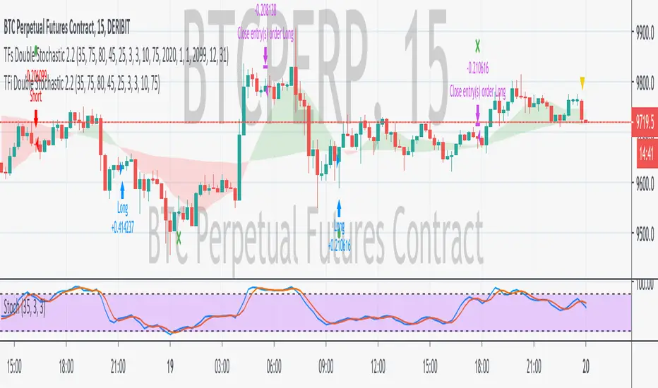
TFs Double Stochastic StrategyThe Strategy script uses Stochastic indicators for entering and exiting a position.
How to use
The strategy works with most timeframes and instruments.
I'm also providing a "study" version of this script, which can be used for automation of the strategy via alerts.
The script is using a default commission of 0.075% which reflects Bitmex' Taker-Fees. This is just a default and can be modified in the strategy settings for each instrument individually.
List of parameters
"Stochastic Length" ... Number of bars for Stochastic indicators
"Stochastic Overbought" ... Stochastic overbought level
"Stochastic Overbought Down Trend" ... Stochastic overbought level for down trends
"Stochastic Oversold Up Trend" ... Stochastic oversold level for up trends
"Stochastic Oversold" ... Stochastic oversold level
"Stochastic Smooth K" ... Stochastic K smoothing
"Stochastic Smooth D" ... Stochastic D smoothing
"MA Filter Enabled" ... Enable an additional filter for entering a position; the entries only follow the overall trend
"Fast Period" ... Fast filter period
"Slow Period" ... Slow filter period
"Backtest ..." ... Backtest timeframe; area outside this timeframe will be grayed out
How to access
This strategy is a "Invite Only" script. Please use the link below or send me a message via Tradingview to obtain access to the strategy and study script.
For enabling the script in your Tradingview chart window, click on "Indicators" and select "Invite-Only Scripts".

888 BOT #backtest█ 888 BOT #backtest
This is an Expert Advisor 'EA' or Automated trading script for ‘longs’ and ‘shorts’, which uses only a Take Profit or, in the worst case, a Stop Loss to close the trade.
It's a much improved version of the previous ‘Repanocha’. It doesn`t use 'Trailing Stop' or 'security()' functions (although using a security function doesn`t mean that the script repaints) and all signals are confirmed, therefore the script doesn`t repaint in alert mode and is accurate in backtest mode.
Apart from the previous indicators, some more and other functions have been added for Stop-Loss, re-entry and leverage.
It uses 8 indicators, (many of you already know what they are, but in case there is someone new), these are the following:
1. Jurik Moving Average
It's a moving average created by Mark Jurik for professionals which eliminates the 'lag' or delay of the signal. It's better than other moving averages like EMA, DEMA, AMA or T3.
There are two ways to decrease noise using JMA. Increasing the 'LENGTH' parameter will cause JMA to move more slowly and therefore reduce noise at the expense of adding 'lag'
The 'JMA LENGTH', 'PHASE' and 'POWER' parameters offer a way to select the optimal balance between 'lag' and over boost.
Green: Bullish, Red: Bearish.
2. Range filter
Created by Donovan Wall, its function is to filter or eliminate noise and to better determine the price trend in the short term.
First, a uniform average price range 'SAMPLING PERIOD' is calculated for the filter base and multiplied by a specific quantity 'RANGE MULTIPLIER'.
The filter is then calculated by adjusting price movements that do not exceed the specified range.
Finally, the target ranges are plotted to show the prices that will trigger the filter movement.
Green: Bullish, Red: Bearish.
3. Average Directional Index (ADX Classic) and (ADX Masanakamura)
It's an indicator designed by Welles Wilder to measure the strength and direction of the market trend. The price movement is strong when the ADX has a positive slope and is above a certain minimum level 'ADX THRESHOLD' and for a given period 'ADX LENGTH'.
The green color of the bars indicates that the trend is bullish and that the ADX is above the level established by the threshold.
The red color of the bars indicates that the trend is down and that the ADX is above the threshold level.
The orange color of the bars indicates that the price is not strong and will surely lateralize.
You can choose between the classic option and the one created by a certain 'Masanakamura'. The main difference between the two is that in the first it uses RMA () and in the second SMA () in its calculation.
4. Parabolic SAR
This indicator, also created by Welles Wilder, places points that help define a trend. The Parabolic SAR can follow the price above or below, the peculiarity that it offers is that when the price touches the indicator, it jumps to the other side of the price (if the Parabolic SAR was below the price it jumps up and vice versa) to a distance predetermined by the indicator. At this time the indicator continues to follow the price, reducing the distance with each candle until it is finally touched again by the price and the process starts again. This procedure explains the name of the indicator: the Parabolic SAR follows the price generating a characteristic parabolic shape, when the price touches it, stops and turns (SAR is the acronym for 'stop and reverse'), giving rise to a new cycle. When the points are below the price, the trend is up, while the points above the price indicate a downward trend.
5. RSI with Volume
This indicator was created by LazyBear from the popular RSI.
The RSI is an oscillator-type indicator used in technical analysis and also created by Welles Wilder that shows the strength of the price by comparing individual movements up or down in successive closing prices.
LazyBear added a volume parameter that makes it more accurate to the market movement.
A good way to use RSI is by considering the 50 'RSI CENTER LINE' centerline. When the oscillator is above, the trend is bullish and when it is below, the trend is bearish.
6. Moving Average Convergence Divergence (MACD) and (MAC-Z)
It was created by Gerald Appel. Subsequently, the histogram was added to anticipate the crossing of MA. Broadly speaking, we can say that the MACD is an oscillator consisting of two moving averages that rotate around the zero line. The MACD line is the difference between a short moving average 'MACD FAST MA LENGTH' and a long moving average 'MACD SLOW MA LENGTH'. It's an indicator that allows us to have a reference on the trend of the asset on which it is operating, thus generating market entry and exit signals.
We can talk about a bull market when the MACD histogram is above the zero line, along with the signal line, while we are talking about a bear market when the MACD histogram is below the zero line.
There is the option of using the MAC-Z indicator created by LazyBear, which according to its author is more effective, by using the parameter VWAP (volume weighted average price) 'Z-VWAP LENGTH' together with a standard deviation 'STDEV LENGTH' in its calculation.
7. Volume Condition
Volume indicates the number of participants in this war between bulls and bears, the more volume the more likely the price will move in favor of the trend. A low trading volume indicates a lower number of participants and interest in the instrument in question. Low volumes may reveal weakness behind a price movement.
With this condition, those signals whose volume is less than the volume SMA for a period 'SMA VOLUME LENGTH' multiplied by a factor 'VOLUME FACTOR' are filtered. In addition, it determines the leverage used, the more volume, the more participants, the more probability that the price will move in our favor, that is, we can use more leverage. The leverage in this script is determined by how many times the volume is above the SMA line.
The maximum leverage is 8.
8. Bollinger Bands
This indicator was created by John Bollinger and consists of three bands that are drawn superimposed on the price evolution graph.
The central band is a moving average, normally a simple moving average calculated with 20 periods is used. ('BB LENGTH' Number of periods of the moving average)
The upper band is calculated by adding the value of the simple moving average X times the standard deviation of the moving average. ('BB MULTIPLIER' Number of times the standard deviation of the moving average)
The lower band is calculated by subtracting the simple moving average X times the standard deviation of the moving average.
the band between the upper and lower bands contains, statistically, almost 90% of the possible price variations, which means that any movement of the price outside the bands has special relevance.
In practical terms, Bollinger bands behave as if they were an elastic band so that, if the price touches them, it has a high probability of bouncing.
Sometimes, after the entry order is filled, the price is returned to the opposite side. If price touch the Bollinger band in the same previous conditions, another order is filled in the same direction of the position to improve the average entry price, (% MINIMUM BETTER PRICE ': Minimum price for the re-entry to be executed and that is better than the price of the previous position in a given %) in this way we give the trade a chance that the Take Profit is executed before. The downside is that the position is doubled in size. 'ACTIVATE DIVIDE TP': Divide the size of the TP in half. More probability of the trade closing but less profit.
█ STOP LOSS and RISK MANAGEMENT.
A good risk management is what can make your equity go up or be liquidated.
The % risk is the percentage of our capital that we are willing to lose by operation. This is recommended to be between 1-5%.
% Risk: (% Stop Loss x % Equity per trade x Leverage) / 100
First the strategy is calculated with Stop Loss, then the risk per operation is determined and from there, the amount per operation is calculated and not vice versa.
In this script you can use a normal Stop Loss or one according to the ATR. Also activate the option to trigger it earlier if the risk percentage is reached. '% RISK ALLOWED'
'STOP LOSS CONFIRMED': The Stop Loss is only activated if the closing of the previous bar is in the loss limit condition. It's useful to prevent the SL from triggering when they do a ‘pump’ to sweep Stops and then return the price to the previous state.
█ BACKTEST
The objective of the Backtest is to evaluate the effectiveness of our strategy. A good Backtest is determined by some parameters such as:
- RECOVERY FACTOR: It consists of dividing the 'net profit' by the 'drawdown’. An excellent trading system has a recovery factor of 10 or more; that is, it generates 10 times more net profit than drawdown.
- PROFIT FACTOR: The ‘Profit Factor’ is another popular measure of system performance. It's as simple as dividing what win trades earn by what loser trades lose. If the strategy is profitable then by definition the 'Profit Factor' is going to be greater than 1. Strategies that are not profitable produce profit factors less than one. A good system has a profit factor of 2 or more. The good thing about the ‘Profit Factor’ is that it tells us what we are going to earn for each dollar we lose. A profit factor of 2.5 tells us that for every dollar we lose operating we will earn 2.5.
- SHARPE: (Return system - Return without risk) / Deviation of returns.
When the variations of gains and losses are very high, the deviation is very high and that leads to a very poor ‘Sharpe’ ratio. If the operations are very close to the average (little deviation) the result is a fairly high 'Sharpe' ratio. If a strategy has a 'Sharpe' ratio greater than 1 it is a good strategy. If it has a 'Sharpe' ratio greater than 2, it is excellent. If it has a ‘Sharpe’ ratio less than 1 then we don't know if it is good or bad, we have to look at other parameters.
- MATHEMATICAL EXPECTATION: (% winning trades X average profit) + (% losing trades X average loss).
To earn money with a Trading system, it is not necessary to win all the operations, what is really important is the final result of the operation. A Trading system has to have positive mathematical expectation as is the case with this script: ME = (0.87 x 30.74$) - (0.13 x 56.16$) = (26.74 - 7.30) = 19.44$ > 0
The game of roulette, for example, has negative mathematical expectation for the player, it can have positive winning streaks, but in the long term, if you continue playing you will end up losing, and casinos know this very well.
PARAMETERS
'BACKTEST DAYS': Number of days back of historical data for the calculation of the Backtest.
'ENTRY TYPE': For '% EQUITY' if you have $ 10,000 of capital and select 7.5%, for example, your entry would be $ 750 without leverage. If you select CONTRACTS for the 'BTCUSDT' pair, for example, it would be the amount in 'Bitcoins' and if you select 'CASH' it would be the amount in $ dollars.
'QUANTITY (LEVERAGE 1X)': The amount for an entry with X1 leverage according to the previous section.
'MAXIMUM LEVERAGE': It's the maximum allowed multiplier of the quantity entered in the previous section according to the volume condition.
The settings are for Bitcoin at Binance Futures (BTC: USDTPERP) in 30 minutes.
For other pairs and other timeframes, the settings have to be adjusted again. And within a month, the settings will be different because we all know the market and the trend are changing.
█ 888 BOT (SPANISH)
Este es un Expert Advisor 'EA' o script de trading automatizado para ‘longs’ y ‘shorts’, el cual, utiliza solo un Take Profit o, en el peor de los casos, un Stop Loss para cerrar el trade.
Es una versión muy mejorada del anterior ‘Repanocha’. No utiliza ‘Trailing Stop’, ni funciones ‘security()’ (aunque usar una función security no significa que el script repinte) y todas las señales son confirmadas, por consiguiente, el script no repinta en modo alertas y es preciso en en el modo backtest.
Aparte de los anteriores indicadores se han añadido algunos más y otras funciones para Stop-Loss, de re-entrada y apalancamiento.
Utiliza 8 indicadores, (muchos ya sabéis sobradamente lo que son, pero por si hay alguien nuevo), son los siguientes:
1. Jurik Moving Average
Es una media móvil creada por Mark Jurik para profesionales la cual elimina el ‘lag’ o retardo de la señal. Es mejor que otras medias móviles como la EMA, DEMA, AMA o T3.
Hay dos formas de disminuir el ruido utilizando JMA. El aumento del parámetro 'LENGTH' hará que JMA se mueva más lentamente y, por lo tanto, reducirá el ruido a expensas de añadir ‘lag’
Los parámetros 'JMA LENGTH', 'PHASE' y 'POWER' ofrecen una forma de seleccionar el equilibrio óptimo entre ‘lag’ y sobre impulso.
Verde : Alcista, Rojo: Bajista.
2. Range filter
Creado por Donovan Wall, su función es la de filtrar o eliminar el ruido y poder determinar mejor la tendencia del precio a corto plazo.
Primero, se calcula un rango de precio promedio uniforme 'SAMPLING PERIOD' para la base del filtro y se multiplica por una cantidad específica 'RANGE MULTIPLIER'.
A continuación, el filtro se calcula ajustando los movimientos de precios que no exceden el rango especificado.
Por último, los rangos objetivo se trazan para mostrar los precios que activarán el movimiento del filtro.
Verde : Alcista, Rojo: Bajista.
3. Average Directional Index (ADX Classic) y (ADX Masanakamura)
Es un indicador diseñado por Welles Wilder para medir la fuerza y dirección de la tendencia del mercado. El movimiento del precio tiene fuerza cuando el ADX tiene pendiente positiva y está por encima de cierto nivel mínimo 'ADX THRESHOLD' y para un periodo dado 'ADX LENGTH'.
El color verde de las barras indica que la tendencia es alcista y que el ADX está por encima del nivel establecido por el threshold.
El color Rojo de las barras indica que la tendencia es bajista y que el ADX está por encima del nivel de threshold.
El color naranja de las barras indica que el precio no tiene fuerza y seguramente lateralizará.
Se puede elegir entre la opción clásica y la creada por un tal 'Masanakamura'. La diferencia principal entre los dos es que en el primero utiliza RMA() y en el segundo SMA() en su cálculo.
4. Parabolic SAR
Este indicador, creado también por Welles Wilder, coloca puntos que ayudan a definir una tendencia. El Parabolic SAR puede seguir al precio por encima o por debajo, la particularidad que ofrece es que cuando el precio toca al indicador, este salta al otro lado del precio (si el Parabolic SAR estaba por debajo del precio salta arriba y viceversa) a una distancia predeterminada por el indicador. En este momento el indicador vuelve a seguir al precio, reduciendo la distancia con cada vela hasta que finalmente es tocado otra vez por el precio y se vuelve a iniciar el proceso. Este procedimiento explica el nombre del indicador: el Parabolic SAR va siguiendo al precio generando una característica forma parabólica, cuando el precio lo toca, se para y da la vuelta (SAR son las siglas en inglés de ‘stop and reverse’), dando lugar a un nuevo ciclo. Cuando los puntos están por debajo del precio, la tendencia es alcista, mientras que los puntos por encima del precio indica una tendencia bajista.
5. RSI with Volume
Este indicador lo creo un tal LazyBear de TV a partir del popular RSI.
El RSI es un indicador tipo oscilador utilizado en análisis técnico y creado también por Welles Wilder que muestra la fuerza del precio mediante la comparación de los movimientos individuales al alza o a la baja de los sucesivos precios de cierre.
LazyBear le añadió un parámetro de volumen que lo hace más preciso al movimiento del mercado.
Una buena forma de usar el RSI es teniendo en cuenta la línea central de 50 'RSI CENTER LINE'. Cuando el oscilador está por encima, la tendencia es alcista y cuando está por debajo la tendencia es bajista.
6. Moving Average Convergence Divergence (MACD) y (MAC-Z)
Fue creado por Gerald Appel. Posteriormente se añadió el histograma para anticipar el cruce de medias. A grandes rasgos podemos decir que el MACD es un oscilador consistente en dos medias móviles que van girando en torno a la línea de cero. La línea del MACD no es más que la diferencia entre una media móvil corta 'MACD FAST MA LENGTH' y una media móvil larga 'MACD SLOW MA LENGTH'. Es un indicador que nos permite tener una referencia sobre la tendencia del activo sobre el cual se está operando, generando de este modo señales de entrada y salida del mercado.
Podemos hablar de mercado alcista cuando el histograma del MACD se sitúe por encima de la línea cero, junto con la línea de señal, mientras que hablaremos de mercado bajista cuando el histograma MACD se situará por debajo de la línea cero.
Está la opción de utilizar el indicador MAC-Z creado por LazyBear que según su autor es más eficaz, por utilizar el parámetro VWAP (precio medio ponderado por volumen) 'Z-VWAP LENGTH' junto con una desviación standard 'STDEV LENGTH' en su cálculo.
7. Volume Condition
El volumen indica el número de participantes en esta guerra entre toros y osos, cuanto más volumen más probabilidad de que se mueva el precio a favor de la tendencia. Un volumen bajo de negociación indica un menor número de participantes e interés por el instrumento en cuestión. Los bajos volúmenes pueden revelar debilidad detrás de un movimiento de precios.
Con esta condición se filtran aquellas señales cuyo volumen es inferior a la SMA de volumen para un periodo 'SMA VOLUME LENGTH' multiplicado por un factor 'VOLUME FACTOR'. Además, determina el apalancamiento utilizado, a más volumen, más participantes, más probabilidad de que se mueva el precio a nuestro favor, es decir, podemos utilizar más apalancamiento. El apalancamiento en este script lo determina las veces que está el volumen por encima de la línea de la SMA.
El apalancamiento máximo es de 8.
8. Bollinger Bands
Este indicador fue creado por John Bollinger y consiste en tres bandas que se dibujan superpuestas al gráfico de evolución del precio.
La banda central es una media móvil, normalmente se emplea una media móvil simple calculada con 20 períodos. ('BB LENGTH' Número de periodos de la media móvil)
La banda superior se calcula sumando al valor de la media móvil simple X veces la desviación típica de la media móvil. ('BB MULTIPLIER' Número de veces la desviación típica de la media móvil)
La banda inferior de calcula restando a la media móvil simple X veces la desviación típica de la media móvil.
la franja comprendida entre las bandas superior e inferior contiene, estadísticamente, casi un 90% de las posibles variaciones del precio, lo que significa que cualquier movimiento del precio fuera de las bandas tiene especial relevancia.
En términos prácticos, las bandas de Bollinger se comporta como si de una banda elástica se tratara de manera que, si el precio las toca, éste tiene mucha probabilidad de rebotar.
En ocasiones, después de rellenarse la orden de entrada, el precio se devuelve hacia el lado contrario. Si toca la banda de Bollinger se rellena otra orden en la misma dirección de la posición para mejorar el precio medio de entrada, (% MINIMUM BETTER PRICE': Precio mínimo para que se ejecute la re-entrada y que sea mejor que el precio de la posición anterior en un % dado) de esta manera damos una oportunidad al trade de que el Take Profit se ejecute antes. La desventaja es que se dobla el tamaño de la posición. 'ACTIVATE DIVIDE TP': Divide el tamaño del TP a la mitad. Más probabilidad de que se cierre el trade pero menos ganancias.
█ STOP LOSS y RISK MANAGEMENT.
Una buena gestión de las pérdidas o gestión del riesgo es lo que puede hacer que tu cuenta suba o se liquide en poco tiempo.
El % de riesgo es el porcentaje de nuestro capital que estamos dispuestos a perder por operación. Este se aconseja que debe estar comprendido entre un 1-5%.
% Risk = (% Stop Loss x % Equity per trade x Leverage) / 100
Primero se calcula la estrategia con Stop Loss, después se determina el riesgo por operación y a partir de ahí se calcula el monto por operación y no al revés.
En este script puedes usar un Stop Loss normal o uno según el ATR. También activar la opción de que salte antes si se alcanza el porcentaje de riesgo. '% RISK ALLOWED'
'STOP LOSS CONFIRMED': Solamente se activa el Stop Loss si el cierre de la barra anterior se encuentra en la condición de límite de pérdidas. Es útil para evitar que se dispare el SL cuando hacen un ‘pump’ para barrer Stops y luego se devuelve el precio a la normalidad.
█ BACKTEST
El objetivo del Backtest es evaluar la eficacia de nuestra estrategia. Un buen Backtest lo determinan algunos parámetros como son:
- RECOVERY FACTOR: Consiste en dividir el ‘beneficio neto’ entre el ‘drawdown’. Un excelente sistema de trading tiene un recovery factor de 10 o más; es decir, genera 10 veces más beneficio neto que drawdown.
- PROFIT FACTOR: El ‘Profit Factor’ es otra medida popular del rendimiento de un sistema. Es algo tan simple como dividir lo que ganan las operaciones con ganancias entre lo que pierden las operaciones con pérdidas. Si la estrategia es rentable entonces por definición el ‘Profit Factor’ va a ser mayor que 1. Las estrategias que no son rentables producen factores de beneficio menores que uno. Un buen sistema tiene un profit factor de 2 o más. Lo bueno del ‘Profit Factor’ es que nos dice lo que vamos a ganar por cada dolar que perdemos. Un profit factor de 2.5 nos dice que por cada dolar que perdamos operando vamos a ganar 2.5.
- SHARPE: (Retorno sistema – Retorno sin riesgo) / Desviación de los retornos.
Cuando las variaciones de ganancias y pérdidas son muy altas, la desviación es muy elevada y eso conlleva un ratio de ‘Sharpe’ muy pobre. Si las operaciones están muy cerca de la media (poca desviación) el resultado es un ratio de ‘Sharpe’ bastante elevado. Si una estrategia tiene un ratio de ‘Sharpe’ mayor que 1 es una buena estrategia. Si tiene un ratio de ‘Sharpe’ mayor que 2, es excelente. Si tiene un ratio de ‘Sharpe’ menor que 1 entonces no sabemos si es buena o mala, hay que mirar otros parámetros.
- MATHEMATICAL EXPECTATION:(% operaciones ganadoras X ganancia media) + (% operaciones perdedoras X pérdida media).
Para ganar dinero con un sistema de Trading, no es necesario ganar todas las operaciones, lo verdaderamente importante es el resultado final de la operativa. Un sistema de Trading tiene que tener esperanza matemática positiva como es el caso de este script.
El juego de la ruleta, por ejemplo, tiene esperanza matemática negativa para el jugador, puede tener rachas positivas de ganancias, pero a la larga, si se sigue jugando se acabará perdiendo, y esto los casinos lo saben muy bien.
PARAMETROS
'BACKTEST DAYS': Número de días atrás de datos históricos para el calculo del Backtest.
'ENTRY TYPE': Para % EQUITY si tienes 10000$ de capital y seleccionas 7.5% tu entrada sería de 750$ sin apalancamiento. Si seleccionas CONTRACTS para el par BTCUSDT sería la cantidad en Bitcoins y si seleccionas CASH sería la cantidad en dólares.
'QUANTITY (LEVERAGE 1X)': La cantidad para una entrada con apalancamiento X! según el apartado anterior.
'MAXIMUM LEVERAGE': Es el máximo multiplicador permitido de la cantidad introducida en el apartado anterior según la condición de volumen.
Los settings son para Bitcoin en Binance Futures (BTC:USDTPERP) en 30 minutos.
Para otro pares y otras temporalidades se tienen que ajustar las opciones de nuevo. Además para dentro de un mes, los ajustes serán otros distintos ya que el mercado y la tendencia es cambiante.

All-in-One Solutions - Long/Short StrategyHello,
I always had in mind that a single strategy cannot be profitable on multiple symbols or commodities ...
This is why I created this strategy where different settings can be applied for each of the symbol you use to trade.
For each symbol you trade, the strategy will ask you for 9 parameters to play with. I already filled the settings for several symbol but it is up to you to find the best 9 parameters for the symbol you like to trade and the time frame you usually use (I often use it in 1H).
The script does not allow any repaint and the Trading view back-testing system is reliable.
For exemple if you like to trade ETH/USD, you have to play with the 9 parameters and find the best net profitability calculated by the back-testing of Trading View.
Here is a screenshot of the setting page of the strategy :
imgur.com
You can find also below the link to all the previous scripts I published :
fr.tradingview.com
PS: please do not ask me to add in this strategy an alert system as Trading View does not allow to implement alerts in strategies script (because strategies scripts run on you computer, where alerts are located on TV servers).
Nevertheless if there is a demand, I can develop an indicator where you can implement the best settings found by you in this strategy and use it as an alerts script.
Please ask me for access, I grant free 1 week full access to all my indicators.
Have fun !
Last Update:
- I added the bar color in order to see on the chart the Long and Short positions
- I added the panels Open and Close positions to be visible on the chart
- I added an horizontal line on the chart when a position is open in order to see on the chart if position is positive or negative
- I modified the parameters description in order to make it more clear
I filled nice settings for 5 cryptos. If you find suitable settings for other commodities, please share the parameters into the comment in order to share with the community.
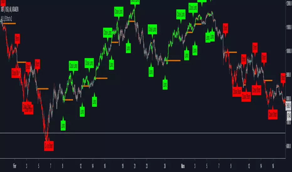
All-in-One Solutions - Long/Short StrategyHello,
I always had in mind that a single strategy cannot be profitable on multiple symbols or commodities...
This is why I created this strategy where different settings can be applied for each of the symbol you use to trade.
For each symbol you trade, the strategy will ask you for 9 parameters to play with. I already filled the settings for several symbol but it is up to you to find the best 9 parameters for the symbol you like to trade and the time frame you usually use (I often use it in 1H).
The script does not allow any repaint and the Trading view back-testing system is reliable.
For exemple if you like to trade ETH/USD, you have to play with the 9 parameters and find the best net profitability calculated by the back-testing of Trading View.
Here is a screenshot of the setting page of the strategy :
imgur.com
You can find also below the link to all the previous scripts I published :
fr.tradingview.com
PS: please do not ask me to add in this strategy an alert system as Trading View does not allow to implement alerts in strategies script (because strategies scripts run on you computer, where alerts are located on TV servers).
Nevertheless if there is a demand, I can develop an indicator where you can implement the best settings found by you in this strategy and use it as an alerts script.
Please ask me for access, I grant free 1 week full access to all my indicators.
Have fun !